I am delighted to introduce a new project that we have developed at Human Progress which maps how on every major metric people’s lives have improved around the world over the last 50 years. It is called Your Life in Numbers, and it allows users to see how countries have changed during their lifetimes in terms of life expectancy, infant mortality, income per person, food supply per person, years of schooling, and level of democracy.
Our data starts in 1960, but we expect that the site will be used mostly by the tech-savvy younger generation, which grew up in the shadow of the Great Recession. The doom and gloom that characterised much of the past decade, with its low growth, high unemployment, high fiscal deficits and stratospheric levels of debt, ought to be kept in proper perspective. The story of human progress is not linear or uninterrupted – there are always setbacks. Yet, in spite of all the bad news that we see on television each day, much of the world continues to improve. Consider the changes that have taken place over the last 50 years:
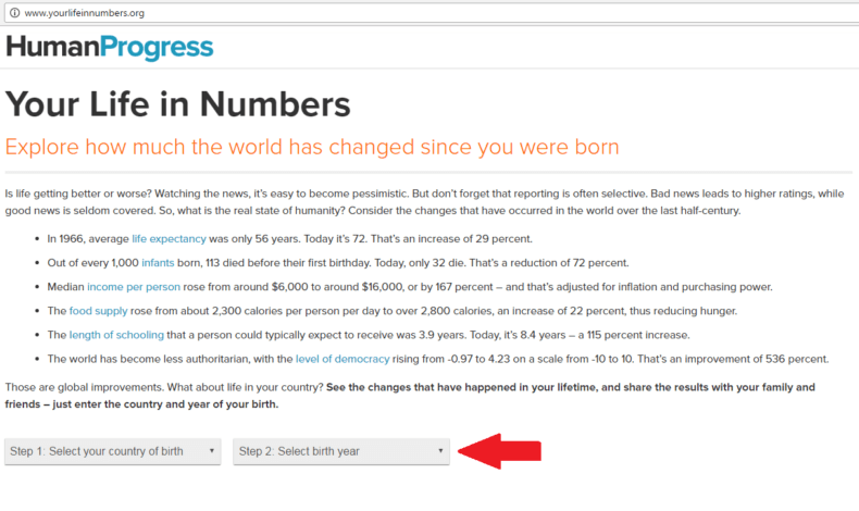
• In 1966, average life expectancy was only 56 years. Today it’s 72. That’s an increase of 29 per cent.
• Out of every 1,000 infants born, 113 died before their first birthday. Today, only 32 die. That’s a reduction of 72 per cent.
• Median income per person rose from around $6,000 to around $16,000, or by 167 per cent – and that’s adjusted for inflation and purchasing power.
• The food supply rose from about 2,300 calories per person per day to over 2,800 calories, an increase of 22 per cent, thus reducing hunger.
• The length of schooling that a person could typically expect to receive was 3.9 years. Today, it’s 8.4 years – a 115 per cent increase.
• The world has become less authoritarian, with the level of democracy rising from -0.97 to 4.23 on a scale from -10 to 10. That’s an improvement of 536 per cent.
We hope that a better understanding of the improving state of humanity will make young people more appreciative of the social and economic underpinnings of our modern society – liberal democracy and free enterprise. We also hope that they will appreciate the tremendous improvements in human well-being in the developing world. In fact, one of the main lessons that we hope the users will take away from visiting and interacting with Your Life in Numbers is that global inequality has been declining as a consequence of economic growth in developing countries.With that, let me explain how Your Life in Numbers works: First, enter the country and year of your birth – as indicated by the red arrow in the screenshot below.

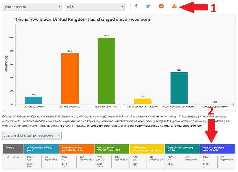
The screenshot below shows how to download an image containing your results which can be sent via email or incorporated into a paper that you are writing. Note, also, the second arrow, which points to a table that contains the absolute values that we used to calculate the changes over the selected period of time (e.g., in 1976, average life expectancy in Great Britain was 72.8 years, while in 2015 it was 80.8 years).

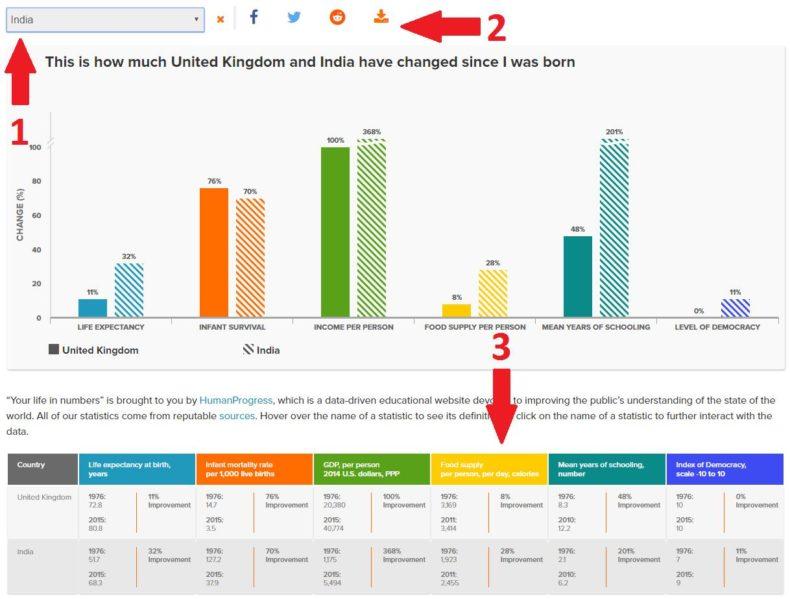
The screenshot below shows how to compare British results with those of another country (first arrow). If you select a developing country, such as India, you will observe that in many ways India has done even better than Great Britain. That is the case with most developing countries, including those in Africa.
Historically, thanks to the Industrial Revolution, which started in Great Britain and then spread throughout the West and its offshoots, a gap in wellbeing emerged between the West and the rest. Now, as a consequence of economic integration (globalization), developing countries tend to be growing faster than developed countries, thus decreasing global inequality.
Once again, you can download your comparison of well-being in two countries or share your results on social media (second arrow). Lastly, observe the change in the table of absolute values, which now contains data not just for Great Britain, but for India as well (third arrow).

I hope that you enjoy your visit to Your Life in Numbers and your interaction with the data. Maybe it will even put a smile on your face.
This article was first published in CapX.


