Summary: Since the Wright brothers’ pioneering flight in 1903, the aviation industry has made remarkable strides in safety, affordability, and accessibility. Comparing flight prices from 1970 to today reveals a staggering 90.8 percent decrease in the time price of flying, with transcontinental flights now affordable for the average person. Additionally, advancements in aviation technology have made flying dramatically safer today than it was in 1970, and are likely to improve flying safety in the future.
The Wright brothers launched the era of aviation on December 17, 1903, with a 12-second flight. Since then, aeronautical engineers and market innovators have made the experience safer, faster, and much more affordable.
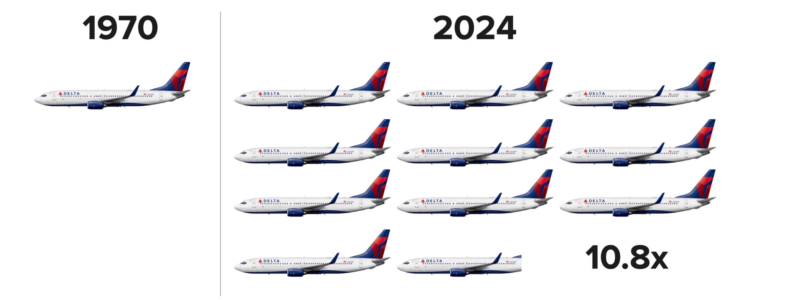
For example, in 1970 the price for a roundtrip ticket from New York to London was $550. Blue-collar workers at the time were earning around $3.93 an hour in compensation (wages and benefits). This suggests a time price of around 140 hours.
Today, the ticket price has dropped to around $467. Blue-collar workers are now earning closer to $36.15 an hour, putting the time price at 12.9 hours. The time price has fallen by 90.8 percent: for the time required to earn the money to buy one flight in 1970, you can get 10.8 flights today.
Flying abundance has increased by 980 percent, compounding at an annual rate of 4.5 percent over the last 54 years. During this same period the global population increased by 4.3 billion (117 percent), from 3.7 billion to more than 8 billion. Every 1 percentage point increase in population corresponded to an 8.4 percentage point increase in flying abundance.
Now transcontinental flights are affordable for almost everyone. Free-market entrepreneurial capitalism isn’t about making more luxuries for the wealthy, it’s about making luxuries affordable for the average person.
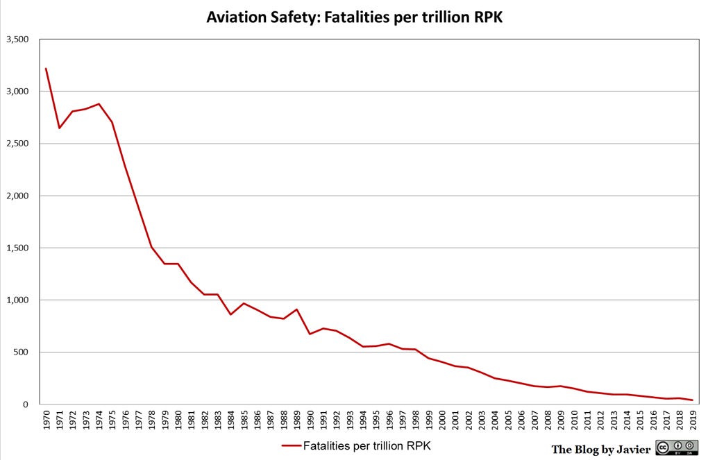
While it is true that the 1970s flights may have had roomier cabins and better dining, flying today is dramatically safer. The Aviation Safety Network tracks airline accident data. Revenue passenger kilometer (RPK) is a standard metric used in aviation. Using this data, Javier Mediavilla plotted the ratio of fatalities per trillion RPK from 1970 to 2019 using five-year averages. The ratio decreased by 98.76 percent, from 3,218 to 40, during this 49-year range. Flying is more than 80.4 times safer today than in 1970, and safety has been improving at a compound rate of around 9.37 percent a year.
Considering both the time price and safety, flying has become 868 times more abundant since 1970 (10.8 x 80.4 = 868). If there had been no innovation in flying since 1970, New York to London airfare would be around $5,059 today. Only the rich could afford transatlantic flights in 1970.
The 3,442-mile flight takes around seven hours. The supersonic Concorde could fly it in less than three. While there are no commercial supersonic flights available today, Boom Supersonic, a private company based in Colorado, aims to bring them back to US airlines by 2029. Perhaps spending half as much time on flights will allow people to use their most valuable resource for other value-creating activities.
This article was published at Gale Winds on 3/26/2024.