fbpx
01 / 05
How the Market Drives Costs

Blog Post | Motor Vehicles

How the Market Drives Costs

Why has the U.S. cost of living fallen in some areas but risen in others?

Summary: This article examines how the market economy drives down the cost of automobiles over time, making them more affordable and accessible to ordinary people. It compares the nominal and time prices of the top ten most popular cars in America in 2000 and 2020, and shows that Americans had to work fewer hours to purchase a car in 2020 than in 2000. It also highlights the improved quality and features of modern cars, and argues that such improvements are largely possible through the innovation and productivity facilitated by a free-market system.


One of the greatest features of modernity is that living standards tend to gradually improve rather than remain largely stagnant – as they did for millennia before 1750 or so. Today, ordinary people have access to goods and services that the royalty of centuries past would never have thought of. Air conditioning, air travel, cell phones, personal computers, automobiles, modern hospitals, antibiotics, GPS, the list goes on. This improvement is largely due to the robust market economy that, through competition, encourages innovation rather than stagnation and complacency. As new technology arises and productivity per person increases, access to goods and services spreads, and the overall wealth of society increases. 

There is much talk about U.S. economic stagnation, but, in many respects, we are better off than we were just over twenty years ago. One positive trend that’s often overlooked and underappreciated is the reduction in the length of time that blue-collar workers need to work in order to purchase a vehicle. 

The falling time price of automobiles 

The table below contains the names of the top ten most popular cars in America in 2020 according to Insurify, a company specializing in online insurance comparisons. It also contains the nominal prices for the base models from 2000 and 2020. The prices come from Autoblog.com, a popular American automotive news and shopping website.
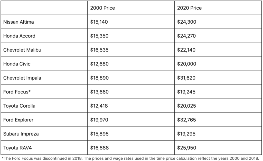
As you can see, the price of cars has risen over the last two decades, reflecting a multitude of factors, including inflation, better technology, and safety features. Cars are no longer simply metal boxes with engines but impressive machines packed with advanced technology.

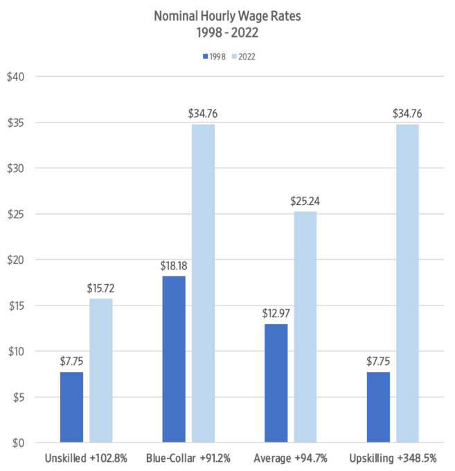
Over the same period, economic productivity, and by extension wages, have not only increased but outpaced rising car prices. According to measuringworth.com, a website of historical economic statistics, the average nominal compensation rate for manufacturing workers rose from 19.36 dollars an hour in 2000 to 32.54 dollars an hour in 2020. The table below shows the number of hours that a blue-collar worker needed to work to earn enough money to be able to afford each car in the years 2000 and 2020. These “time prices” were calculated by dividing the nominal price of the car by the nominal hourly compensation rate.
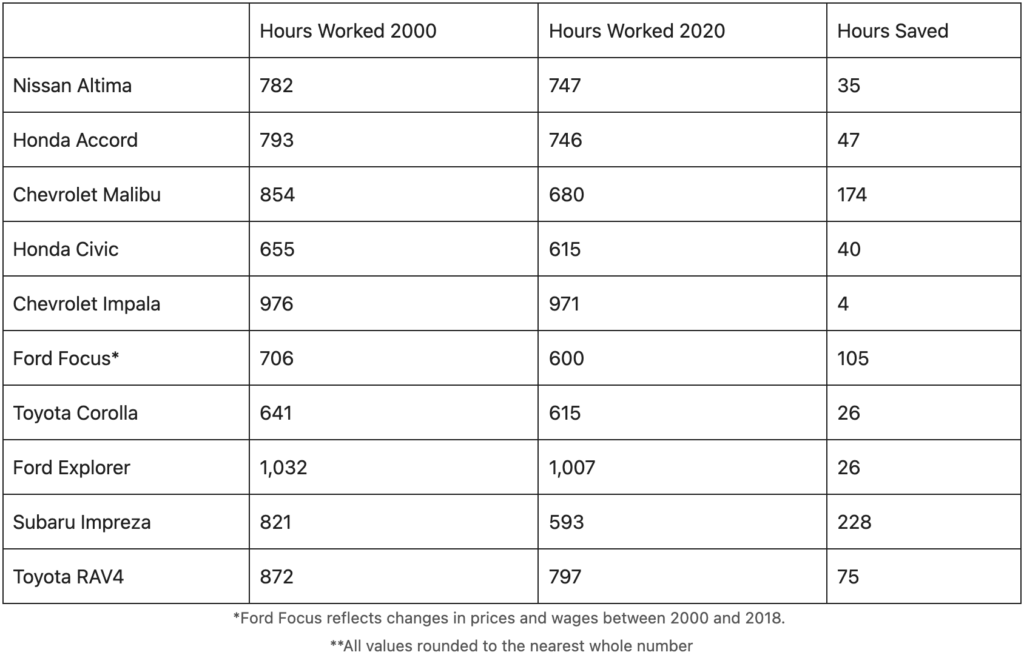
As shown by the data, Americans in 2020 had to work fewer hours to purchase a car than in 2000. Increases in productivity, which typically lead to higher wages, outpaced rising car prices. And, the cars for sale in 2020 were much higher quality than those in 2000, many of which had worse gas mileage, fewer safety features, and no air conditioning.

On average, Americans save 35 hours of work (almost a week) when purchasing a vehicle. Those working hours can now be used for other things, a perfect example of how free-market competition gradually improves living standards for all members of society.

Losing ground in some other areas 

Although Americans are seeing many improvements in the quality and quantity of products relative to their wages, the trend is not universal. In the automobile industry, the incentives are arranged in a way that drives competition and innovation. However, some industries are not as exposed to market forces, often due to a combination of excessive government intervention and insulation from fluctuations in supply and demand.

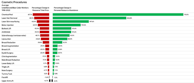
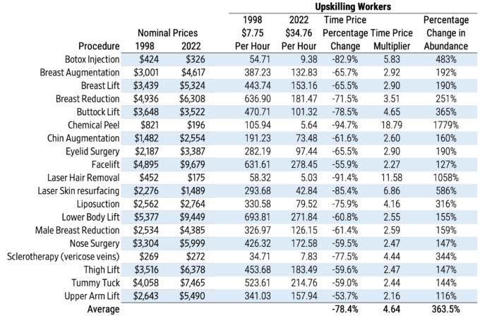
Mark J. Perry from the American Enterprise Institute, a think-tank in Washington, D.C., shows that dynamic in the healthcare sector. He notes that the cost of medical care services and hospital fees rose 128 percent and 220 percent respectively between 1998 and 2020. Meanwhile, the costs of cosmetic surgeries have increased at a far more gradual pace, with some even declining in price.
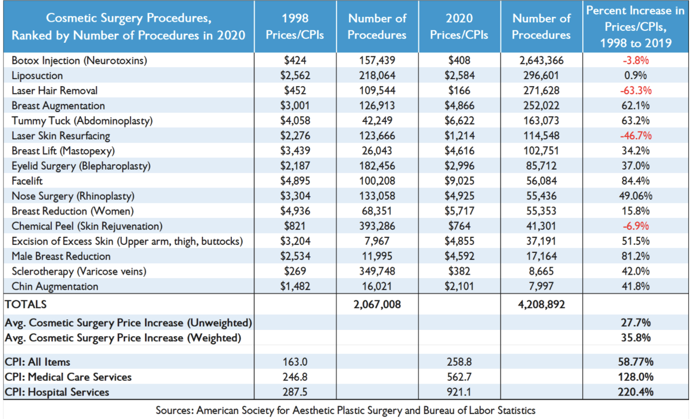
Perry argues that some of this disparity can be explained by the manner in which cosmetic surgeries, on the one hand, and medical care and hospital services, on the other hand, are paid for. He writes,

“One of the reasons that the costs of medical care services in the US have increased more than twice as much as general consumer prices since 1998 is that a large and increasing share of medical costs are paid by third parties (private health insurance, Medicare, Medicaid, Department of Veterans Affairs, etc.) and only a small and shrinking percentage of healthcare costs are paid out-of-pocket by consumers.”

In particular, he notes that out-of-pocket costs have gone from almost half of total healthcare costs in the 1960s to just under 11 percent in 2019. With the consumer paying only a fraction of the bill, health providers no longer have to keep prices low to stay competitive. Instead, they negotiate prices with insurance companies and the government, institutions which have a far smaller incentive to shop around for the lowest price or seek alternative solutions when faced with rising costs.

Cosmetic surgeries are financed differently–almost all costs are paid out of pocket by consumers. As such, there is a higher level of transparency as well as price sensitivity, and the services are cheaper.

A similar dynamic exists in the U.S. higher education system, where a large share of the cost is covered by third parties, such as private loan companies, government-backed debt, and taxpayer dollars. Again, time prices (i.e., nominal tuition prices divided by nominal blue-collar hourly compensation rate) show that Americans are working far longer to afford college attendance today than in the past. 
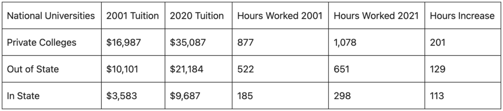
Source: US News, Human Progress.org

Some of the price increases can be attributed to universities providing additional services, such as excellent athletic facilities, better food and lodgings, etc. However, some of the price increases can also be attributed to the incentives that govern the higher education sector. Much like healthcare, a large portion of college funding comes from third parties, not consumers themselves. According to a 2016 paper published by the nonpartisan National Bureau of Economic Research,

“We measure how much changes in underlying costs, reforms to the Federal Student Loan Program (FSLP), and changes in the college earnings premium have caused tuition to increase. All these changes combined generate a 106% rise in net tuition between 1987 and 2010, which more than accounts for the 78% increase seen in the data.”

Furthermore, a 2016 paper published by Mahyar Kargar of the University of Illinois and William Mann of Emory University, which examined the effect of tightened lending standards for federal student loans, found that more restrictive policies resulted in net decreases in college tuition. That further supports the notion that the government, as a highly influential third-party lender, is largely responsible for driving up the cost of tuition because it creates artificial demand through excessive funding. Instead of being forced to compete for consumers with low out-of-pocket prices and high-quality education, university administrators face similar incentives to the healthcare providers (i.e., a large part of their revenue comes from third-party lenders such as the government, who are less sensitive to price increases). The authors conclude,

“Finally, the large average markup that we estimate suggests that a simple subsidy to consumers may not necessarily be the ideal financial aid design, and that policymakers should instead target barriers to competition in the form of large fixed costs.”

Policymakers should heed the above lessons. The market forces of competition and price sensitivity, combined with increasing productivity that leads to higher wages, allow living standards to rise. However, government policies and perverse incentives can shield service providers from market forces, undermining competition and eroding U.S. standards of living.

Blog Post | Cost of Living

A New Way to Understand American Abundance

Our index measures how long you have to work to buy what you used to buy.

Summary: Our new American Abundance Index measures living standards by asking one question: How long do you have to work to buy what you used to buy? Time prices offer a clearer view of American abundance than wages or dollar prices alone. Using standard government data, the index shows that despite recent inflation concerns, time prices have generally fallen and abundance has risen over the long term for the average worker.


Americans are told, daily, that they are getting poorer. The left points to “record” prices and concludes that capitalism has failed. The right points to the same prices and concludes that America is in irreversible decline. Both sides lean on a familiar statistical trick: they talk about prices or pay in isolation, then invite readers to fill in the rest with anxiety.

There is a simpler and truer way to judge living standards. Ask one question: How long do you have to work to buy what you used to buy?

That is the idea behind the new American Abundance Index, a tool that translates economic health into units normal people understand: hours of work. It uses standard government statistics, comparing inflation (the Consumer Price Index) with hourly earnings from the Bureau of Labor Statistics. The output is not a partisan narrative. It is a measure of purchasing power that speaks plain English.

The index tracks two measures. Time Price represents how many work-hours are needed to purchase the standard CPI basket of goods and services. Abundance is the inverse. It represents how much of that basket one hour of work can buy.

When time prices fall, abundance rises. When time prices rise, abundance falls.

The American Abundance Index starts in March 2006, when the relevant earnings series become available, and updates monthly following BLS releases. It reports month-over-month, year-over-year, five-year, ten-year, and since-start changes so readers can separate short-term noise from long-term reality.

That distinction matters because the loudest arguments about living standards are usually built on selective time windows.

Recent numbers illustrate the point. For the average private-sector worker, December 2025 saw a tiny monthly decline in CPI and a larger rise in average hourly earnings. The result was a decline in time prices and a rise in abundance for that month. Over the year from December 2024 to December 2025, CPI rose 2.68 percent while hourly earnings rose 3.76 percent. Time prices fell 1.04 percent, and abundance rose 1.05 percent.

Zoom out further. Since March 2006, time prices for the BLS basket have fallen 12.16 percent and abundance has risen 13.84 percent. The index translates those findings into an intuitive claim: over that period, the average private-sector worker gained the equivalent of roughly 1.1 extra hours of purchasing power for every eight hours worked.

The product is not just one headline series. It includes separate views for all private-sector workers and for blue-collar workers. It also includes “upskilling” scenarios that reflect a basic fact of labor markets that both ideological camps often ignore: people do not stay in the same job, at the same wage, for decades. Many workers move from entry-level roles into higher-paying roles as they gain skills. A living-standards tool should help readers see what that typical path implies for purchasing power over time, rather than freezing workers in place for rhetorical effect.

So how does this fit into today’s abundance argument, and the misuse of statistics by left and right?

The left’s favorite move is to spotlight prices, preferably the most salient and emotionally charged ones, then treat the price level as the full story. But prices are only half the equation. Wages and work-hours are the other half. If pay rises faster than prices, the public is not “getting poorer” in any meaningful aggregate sense, even if the public is angry, and even if some groups are falling behind.

The right’s favorite move is different but no less misleading. It treats every inflation episode, every housing squeeze, and every bout of consumer pessimism as proof of national decline. It cherry-picks peaks, ignores recoveries, and sometimes talks as if today’s worker has no mobility and no capacity to adapt. That is how you turn real problems into a permanent story of collapse.

The American Abundance Index does not settle policy debates. It disciplines them. It forces advocates to answer the question that matters to households: How many minutes of my life does this cost, and how has that changed? If your preferred policy raises time prices, you are making people poorer, whatever your rhetoric. If it lowers time prices, you are making people richer, even if it offends someone’s ideology.

The index is also candid about limits. It focuses on averages, may not capture individual experiences, and is most meaningful over longer periods than a single month. That is not a weakness. It is a reminder that serious measurement should separate broad trends from personal hardship, and that anecdotes are not statistics.

If journalists and politicians want fewer mirages and more reality, they should start here: stop counting dollars. Start counting hours.

Blog Post | Cost of Living

Are Americans Getting Richer? New Data Might Surprise You

Workers have proven resilient over the past decade, despite inflation and valid affordability fears.

Summary: We introduce the American Abundance Index, which measures living standards by how many hours Americans must work to afford a standard basket of goods, rather than by prices or wages alone. The index uses time prices to show that for most US workers, purchasing power has generally risen over the last two decades, even amid inflation and public pessimism.


The resilience of the American worker is one of the most underreported stories of the 2020s. From red tape to import taxes, successive governments have erected barriers to success. Yet America’s workers have persevered and figured out ways to prosper.

A new American Abundance Index illustrates this. The project from Human Progress, an arm of the Cato Institute, reveals the steady rise of the average worker’s purchasing power. The premise of the index is simple: how many hours do you need to work, compared to the month or year before, to be able to afford the “basket of goods,” which is a standard set of household items and services that comprise the Consumer Price Index used to calculate inflation.

The “time price” is how many hours of work it takes to purchase the basket of goods. The “abundance” is how much of the basket one hour of work can buy. The story told by the index is a very good one: since recordkeeping began, “abundance” for average private sector workers comes out to a net increase of 13.8 percent.

It increased the past year, too. The index shows the average private sector worker saw prices rise by 2.7 percent from December 2024 to December 2025, while their hourly wages grew by 3.8 percent. This means workers could work 1 percent less to buy the same basket of goods. Put differently, workers could afford 1 percent more stuff.

The reason for this is that earnings have continued to outpace inflation. So long as wages increase faster than inflation, the worker gets ahead. And it’s not just desk jobs that have enabled workers to purchase the same amount of goods and services for fewer hours worked. The gain for traditional “blue collar workers” is even higher: a historical net increase of 18.4 percent since 2006.

Despite workers significantly increasing their purchasing power over the past two decades, the past five years have taken a toll. The self-inflicted pain of printing vast sums of money during the pandemic sent the annualized inflation rate to over 9 percent in 2022, far outstripping raises. While inflation is now mostly under control, it has taken time for the gap between wages and inflation to settle, and workers are only now just catching up after their losses during those inflation-heavy years.

Americans continue to rank affordability as a top concern and do not believe the government is doing enough to address the cost of living. These frustrations are understandable. Prices are still rising while tariffs and uncertainty strangle businesses and push consumer confidence to a 12-year low. America’s growth and prosperity story has always been one of fits and starts, and workers are right to demand that government gets out of their way. But the new data make clear that 21st century Americans can still be content about how far they’ve come and optimistic about how far they’ve yet to go.

This article was originally published in the Washington Post on 2/6/2026.

Blog Post | Cost of Living

Introducing the American Abundance Index

American living standards are best measured in time.

We are excited to share a new tool we’ve been building at Human Progress: The American Abundance Index—an interactive dashboard that tracks US living standards while adjusting for both inflation and rising incomes.

The idea is straightforward: how many hours do you need to work to afford the same basket of goods and services? Using Bureau of Labor Statistics data, the American Abundance Index converts price and wage growth into “time prices”—the amount of work time required to buy the Consumer Price Index (CPI) basket of goods and services—and “abundance,” which is the inverse: how much of that basket one hour of work can buy. When time prices fall, abundance rises, and each hour of work goes further. That’s the measure of affordability that actually matters.

Conceptually, this work builds off of Superabundance, a book by our editor, Marian Tupy, and his coauthor and Human Progress board member, Gale Pooley. Their core argument—that abundance is best measured in time—forms the foundation of the project. The index itself was built by our Quantitative Research Associate, Jackson Vann.

Users can select multiple worker categories, compare short- and long-run trends, and even see wage growth modeled to reflect real career progression rather than freezing workers in place. All the calculations are transparent and replicable, with the full dataset and code available on GitHub.


So what does the index actually say about American standards of living?

Over the past 12 months, inflation rose 2.68 percent while hourly earnings for the average private-sector worker grew 3.76 percent. As a result, the CPI basket became 1.05 percent more abundant. Since 2006, it has become nearly 14 percent more abundant—roughly equivalent to adding an hour of purchasing power to the average workday.

Blog Post | Cost of Living

Rethinking the Cost of Living with Mark Perry’s “Chart of the Century”

Always compare prices to hourly wages to understand the true change in living standards.

Summary: Comparing nominal price changes to changes in average hourly wages from 2000 to 2025, we can see that many goods with rising dollar prices have become more affordable in time prices.


Professor Mark Perry from the American Enterprise Institute recently posted an updated version of his “Chart of the Century,” featuring price and wage data from the Bureau of Labor Statistics (BLS). The chart tracks 14 items over the 25-year period from January 2000 to December 2025. It also includes the overall inflation rate and changes in average hourly wages.

To examine the data from a different perspective, we calculated the change in the time prices of these 14 items relative to the change in the average hourly wage rate. We then calculated the abundance multiplier—a value indicating how many units you could buy today for the time it took to earn money to buy one unit in 2000. If there were no change, the abundance multiplier would equal one. A value below one indicates decreasing abundance, while a value above one reflects increasing abundance. We also calculated the percentage change in abundance for each item.

This analysis illustrates that things can become more expensive in dollar terms while simultaneously becoming more affordable in time prices. For instance, while the general Consumer Price Index (CPI) rose by 92.6 percent, average hourly wages increased by 131.1 percent. As such, time prices fell by 16.7 percent. For the time it took to earn enough money to purchase one CPI basket in January 2000, a consumer could purchase 1.2 baskets in December 2025—an abundance increase of 20 percent.

Notably, categories such as housing, food and beverages, new cars, household furnishings, and clothing all increased in money prices; however, after adjusting for rising wages, they all became more affordable in time-price terms. Although 10 of the 14 items rose in nominal prices over the 25-year period, only five had higher time prices when accounting for the 131.1 percent increase in hourly wages.

Find more of Gale’s work at his Substack, Gale Winds.