fbpx
01 / 05
Luck or Insight? The Simon-Ehrlich Bet Re-Examined

Blog Post | Wealth & Poverty

Luck or Insight? The Simon-Ehrlich Bet Re-Examined

Resources are clearly becoming more, not less, abundant in relation to the labor time it takes to "buy" them.

Introduction

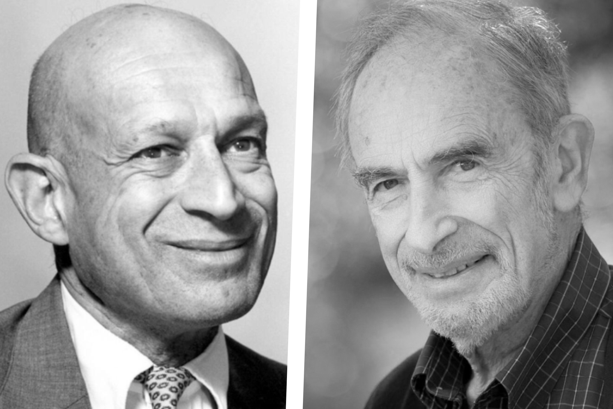
During the 1970s, University of Maryland economist Julian Simon and Stanford University biologist Paul Ehrlich provided the public with two very different visions of the future on the pages of Science and a variety of other publications. The dystopian Population Bomb (Ehrlich, 1968) and the cornucopian Ultimate Resource (Simon, 1981) give the flavour of this debate. Both Simon and Ehrlich agreed that there was a relationship between abundance of resources and population growth, but disagreed on the nature of the relationship. A neo-Malthusian, Ehrlich argued that, as population increased, resources would become scarcer and prices would increase dramatically. Simon argued the opposite. He claimed that as population increased, resource prices would actually decline. Simon admitted that temporary price spikes would occur, but predicted greater abundance of resources in the long run. He argued that people would respond to price spikes in four ways: they would consume less, search for new supplies, invent and discover substitutes, and recycle. These four actions would result in long-run prices that were even lower than before the spike.

The Bet

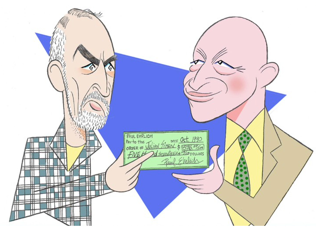
Frustrated with the limited progress that he was making in the argument, Simon upped the ante and challenged Ehrlich to a wager. Ehrlich would choose a $1,000 basket of raw materials that he expected to become less abundant in the coming years and choose a time period of more than a year, during which those raw materials would become more expensive. At the end of that period, the inflation-adjusted price of those materials would be calculated. If the real price of the basket was higher at the end of the period than at the beginning, that would indicate the materials had become more precious and Ehrlich would win the wager; if the price was lower, Simon would win. The stakes would be the ultimate price difference of the basket at the beginning and the end of the time period.

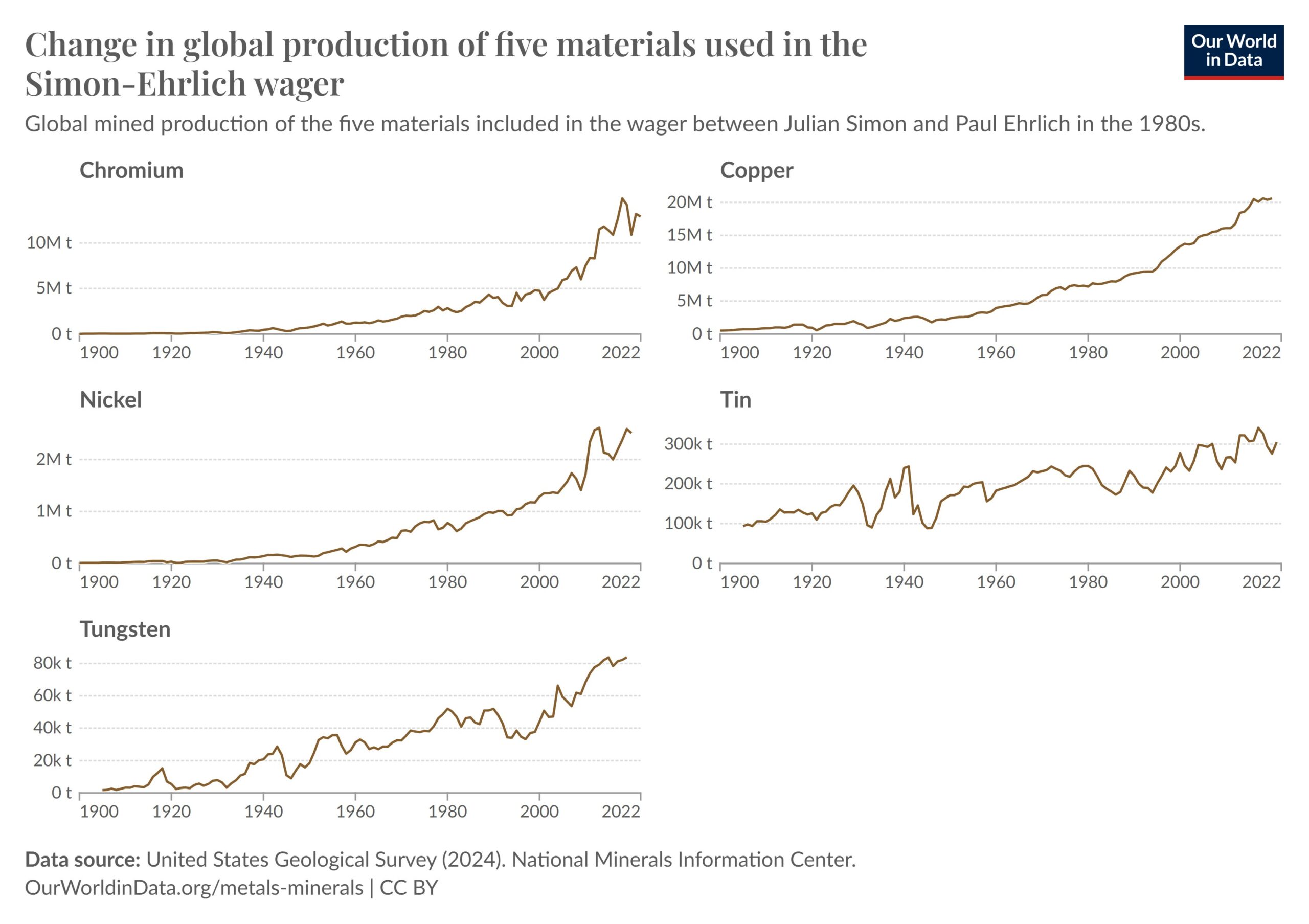
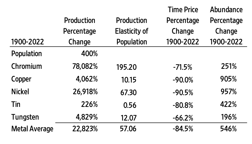
Ehrlich chose copper, chromium, nickel, tin, and tungsten, and the $1,000 wager was sealed in a contract on 6 October 1980. Ten years later Simon received a cheque from Ehrlich in the amount of $576.07, dated 11 October 1990. Adjusted for inflation, the real price of the basket of metals had fallen by 36 per cent.

It should be noted that Simon originally proposed a $10,000 bet. After Ehrlich and his two partners (Harvard University scientist John Holdren and University of California at Berkeley ecologist John Harte) agreed to the idea, Simon reduced the amount to $1,000. He argued that the purpose of the wager was the principle, not the amount. Ehrlich and his partners complained about the reduced size of the wager. However, without this reduction, the Ehrlich trio would have lost $5,760.70 instead of $576.07. Simon reduced their losses by 90 per cent, saving them $5,184.63.

Was Simon Just Lucky?

A number of researchers have argued that Simon was lucky. Several have analysed prices of the same basket of metals over ten-year intervals, including Kiel, Matheson, and Golembiewski (2009), McClintick and Emmett (2005), and Perry (2008).

Kiel et al. conducted the most comprehensive study, looking at price changes of the five metals in ten-year intervals between 1900 and 2007. They used nominal price data collected and reported by the U.S. Geological Survey, and then adjusted those prices for inflation using the US Consumer Price Index (CPI). As the CPI only goes back to 1913, Kiel et al. converted the first 13 years to real prices using estimates provided by McCusker (2001).

Using 98 ten-year intervals based on successive years between 1910 and 2007, they found that Ehrlich would have won the bet 61.2 per cent of the time with an average return of 10.5 per cent. They also used 25-year intervals and found that Ehrlich would have won 59 per cent of the time with a return of 13.8 per cent. The rate of return was calculated as the percentage difference between the inflation-adjusted prices for the intervals.

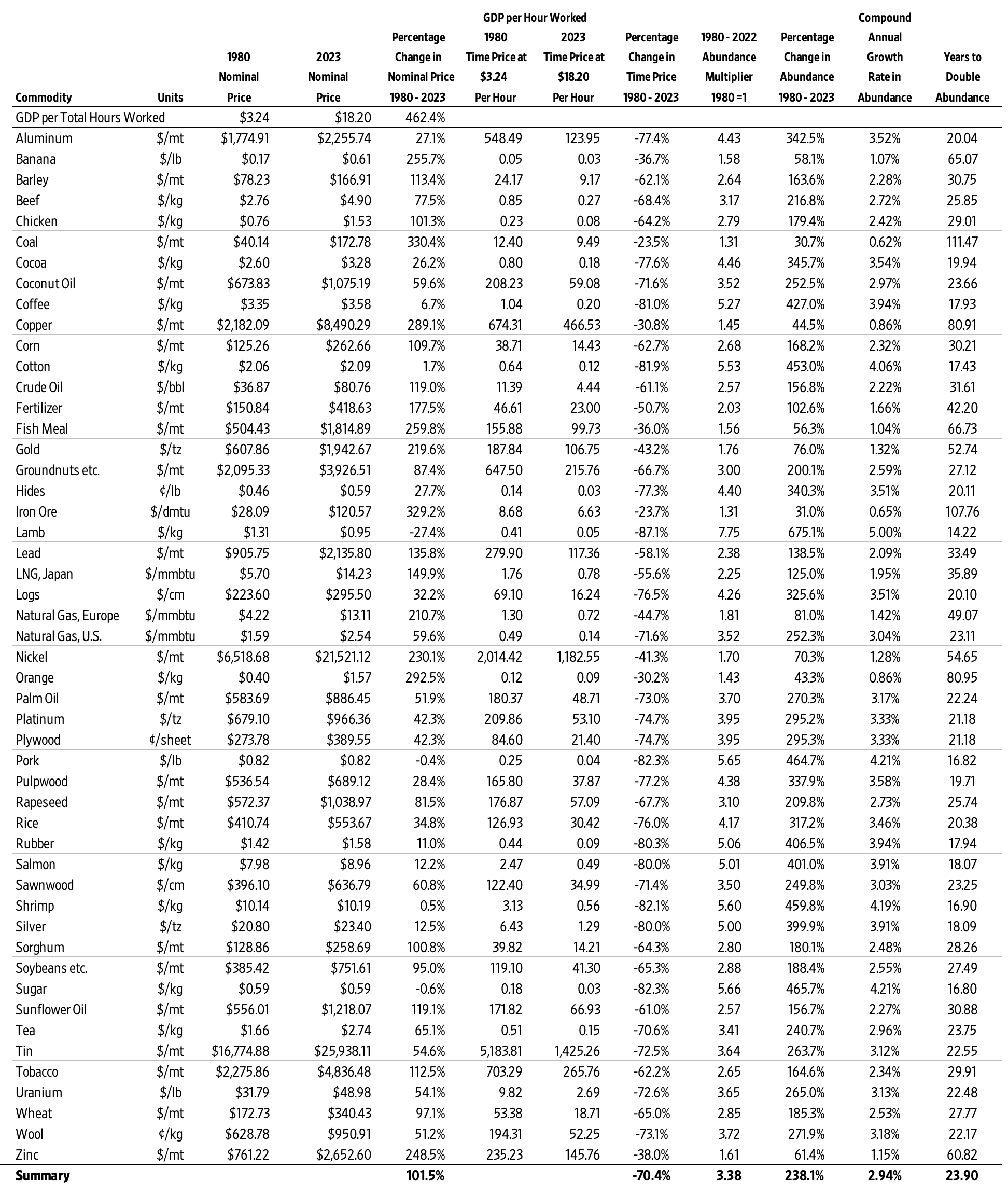
Our analysis covers the period from 1900 to 2019, or 110 ten-year intervals. We relied on the U.S. Geological Survey for our data as well. We made two modifications to the Kiel et al. methodology, namely using time prices and the war clause.

First, prices ought to be compared with income in order fully to understand changes in abundance. Therefore, we use time prices in our analysis. Time prices are equal to nominal prices divided by nominal hourly compensation. Money prices are expressed in dollars and cents. Time prices are expressed in hours and minutes. For the denominator in our ratios we relied on production or blue-collar hourly compensation as reported by Miami University economist Samuel H. Williamson and University of Illinois at Chicago economist Lawrence H. Officer who run the well-known economic history website measuringworth.com. Their data series relies on the U.S. Bureau of Labor Statistics and other sources.

When analysed with time prices, Simon wins the bet 54.2 per cent of the time. The average return over this 110-year range also favours Simon (2.22 per cent).

The “War Clause”

The original Simon–Ehrlich bet included a war clause according to which the agreement would be null and void should the United States be at war on 24 September 1990. The United States last declared war on 8 December 1941. However, military action in Korea and Vietnam, and most recently the War on Terror, should be interpreted as “wars” (see Doe v. Bush, 2003). From 1910 to 2019, the US was at war in 37 years, or 33.6 per cent of the time. If we remove the years for World War I, World War II, the Korean War, the Vietnam War, and the War on Terror, we end up with 73 ten-year bets to analyse. Simon would win those bets 69.9 per cent of the time with a return of 18.0 per cent.

Overall Index and Population

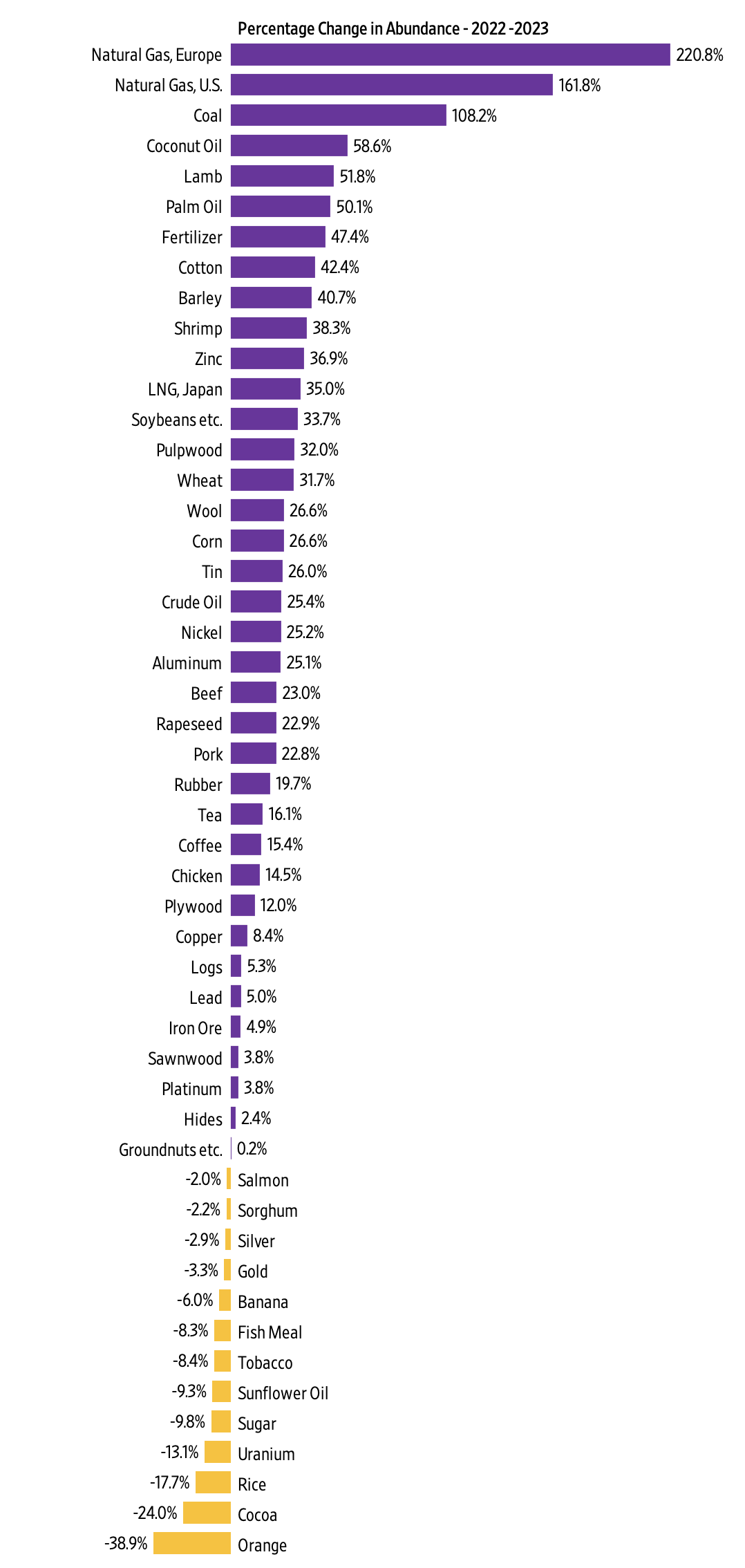
Even more important than the change in the time price of the five-metal basket between 1900 and 2019 is the relationship between commodity prices and population growth. World population was 1.6 billion in 1900. By 2019, it had increased by six billion, or 375 per cent. Over the same time period, it increased in the United States from 76.2 million to 329 million or 330 per cent.

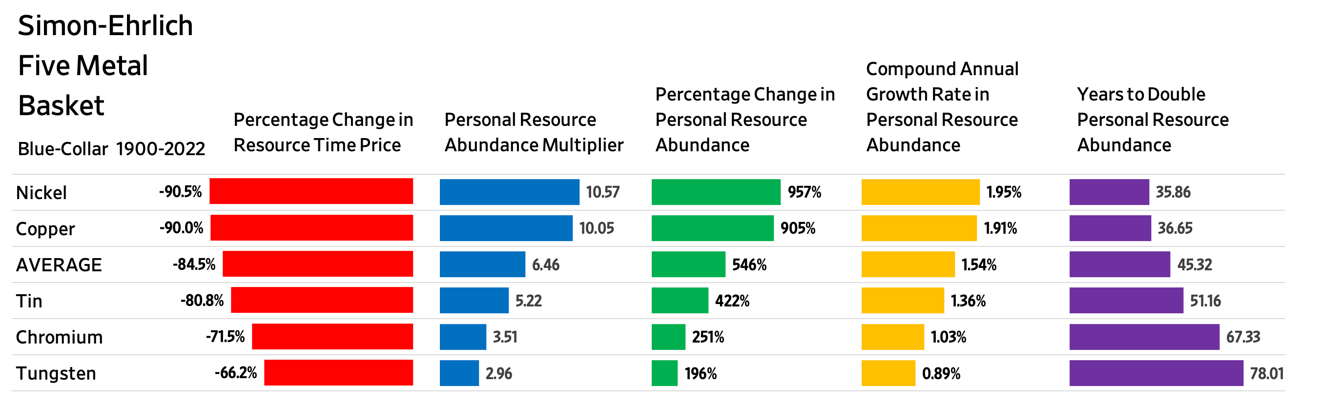
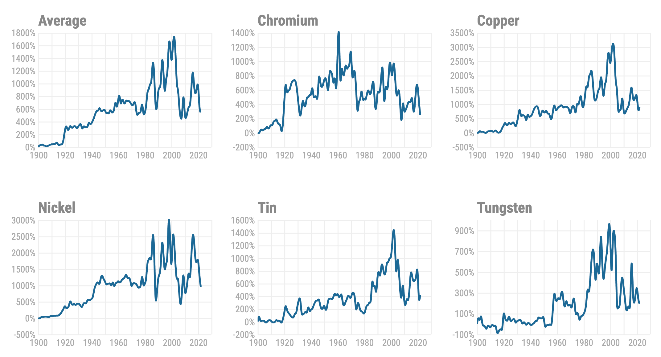
While the nominal prices of the five-metal basket increased 2,909 per cent over this 119-year period, blue-collar hourly income increased by 23,485 per cent. Consequently, the time price of the five-metal basket of commodities index fell by 87.2 per cent – from 100 in 1900 to 12.7 in 2019. The index was above 100 in only five of the 119 years analysed, and for two of those years the United States was involved in World War I.

The real winners of the increase in resource abundance are ordinary people. For blue-collar workers, the time required to earn enough money to buy one basket of five metals in 1900 buys 7.84 baskets today. Overall abundance of the five metals increased 684 per cent, indicating a compound annual growth rate of 1.75 per cent between 1900 and 2019. Unskilled workers enjoyed a significant increase in abundance as well. The time required to earn enough money to buy one basket of five metals in 1900 buys 4.86 baskets today. That indicates a 386 per cent increase in abundance and a compound annual growth rate of 1.34 per cent.

Conclusion

The Simon–Ehrlich bet provides academics with plenty to argue over, but the larger trend is unambiguous – resources are becoming more, not less, abundant in relation to the labour time it takes to “buy” them. The period since 1900 has been marked by world wars, famines and depressions. Yet population grew at an average rate of 1.33 per cent per year and the five-metal basket of commodities grew more abundant at an average rate of 1.75 per cent per year. Adding the increase in population and the increase in abundance indicates a combined rate of around 3.08 per cent, indicating a doubling of abundance every 23 years. These figures are a salutary reminder to those who, like Paul Ehrlich, see resource constraints as limiting economic progress.

References

Ehrlich, P. (1968). The Population Bomb. Cutchogue, NY: Buccaneer Books.

Kiel, K., Matheson, V., & Golembiewski, K. (2009). Luck or Skill? An Examination of the Ehrlich–Simon Bet. Faculty Research Series, Paper No. 09-08. Worcester, MA: Department of Economics, College of the Holy Cross.

McClintick, D. & Emmett, R. (2005). Betting on the wealth of nature: The Simon–Ehrlich wager. PERC Reports, 23(3), 16–17.

McCusker, J. J. (2001). How Much Is That In Real Money? A Historical Price Index for Use as a Deflator of Money Values in the Economy of the United States (2nd ed.). Worcester, MA: American Antiquarian Society.

Perry, M. (2008). Would Julian Simon have won a second bet? Carpe Diem, 13 February. https://mjperry.blogspot.com/2008/02/would-julian-simon-have-won-second-bet.html (accessed 16 November 2019).

Simon, J. (1981). The Ultimate Resource. Princeton, NJ: Princeton University Press.

Case Cited

Doe v. Bush, 323 F.3d 133. (1st Cir. 2003).

This article was originally published by the Institute of Economic Affairs, and can be found in the Wiley Online Library.

Blog Post | Natural Resource Prices

Update on the Five Metals from the Simon–Ehrlich Bet

Since 1900, the average abundance of these five metals has increased 36.5 percent faster than the population.

Summary: The Simon–Ehrlich wager famously demonstrated that population growth does not lead to resource scarcity but instead drives innovation and abundance. Since 1900, the production of five metals featured in the bet has risen dramatically. This bolsters Julian Simon’s argument that human ingenuity and technological progress enable us to produce more resources at lower costs, ensuring greater abundance even as populations grow.


Hannah Richie at OurWorldinData.org recently published an insightful article on the five metals featured in the Simon–Ehrlich wager. In 1990, Paul Ehrlich lost the 10-year bet and had to write a check to Julian Simon for $576.07. Simon had let Ehrlich pick the five metals in 1980 when the bet started. The payment reflected the inflation-adjusted decline of 36 percent in the average price of the five metals over the decade. This was despite an extraordinary global population increase during the 1980s of 850 million people (19 percent)—the largest growth in human history. Yet, even with this surge, resource prices dropped, reinforcing Simon’s argument that human population growth, coupled with ingenuity and the freedom to innovate, drives resource abundance rather than scarcity.

Libertarian economist Julian Simon made a famous wager with the renowned doomsayer Paul Ehrlich in 1980. Simon challenged Ehrlich to choose five metals that he believed would increase in price over the next decade. After the bet concluded, Ehrlich, humbled by the outcome, handed Simon a check, having lost the wager.

Richie highlights an important trend: The long-term abundance of these metals has increased significantly. Take a look at the staggering growth in their production since the early 1900s:

The five metals in the Simon-Ehrlich wager have actually become more abundant over time. The production of each of these metals has grown dramatically, defying Ehrlich's predictions of scarcity and rising prices.

Between 1900 and 2000, the global population grew by 400 percent, from 1.6 billion to 8 billion. During the same period, the production of the five metals soared: Chromium increased by an astounding 78,082 percent, copper by 4,062 percent, nickel by 26,918 percent, tin by 226 percent, and tungsten by 4,829 percent. On average, production of these metals rose by 22,823 percent.

The relationship between population growth and resource production is captured by the production elasticity of the population. It is the ratio of the percentage change in production divided by the percentage change in population. On average, every 1 percent increase in population corresponded to a 57.06 percent increase in the production of these five metals.

In our book Superabundance, we compared the time prices of these five metals for blue-collar workers from 1900 to 2018 and have since updated the data to 2022.

The prices of the five metals have also decreased over time, meaning fewer labor hours are required for a worker to afford them. This reflects both rising wages and falling commodity prices, which are indicators of growing progress and abundance.

The charts below detail the growth in abundance for each resource since 1900. Please note that vertical scales differ across the charts. The charts generally show the effects of 9/11, the financial crisis of 2008, and COVID-19 lockdown policies.

Since 1900, the metals have become much more abundant, even as the global population has grown. This demonstrates that humanity is not a burden on the earth's material resources; rather, through innovation and production, people have been able to expand resource availability.

This table summarizes our findings.

Between 1900 and 2022, the production, time price, and abundance of each of the metals have all increased. The chart also highlights the production elasticity of population, showing how the growth in population has been accompanied by a corresponding increase in metal production.

From 1900 to 2022, the global population increased by 400 percent. Over the same period, the abundance of these five metals increased by an average of 546 percent, demonstrating that abundance has grown 36.5 percent faster than the population.

Some have suggested that Simon was just lucky. This is why looking at a much longer time period reveals underlying trends behind temporary fluctuations.

These data reinforce Simon’s prediction: The more people, the more we produce, and the lower the prices.

Tip of the hat: Max More

This article was published at Gale Winds on 1/14/2025.

Blog Post | Energy & Natural Resources

The Simon Abundance Index 2024

The Earth was 509.4 percent more abundant in 2023 than it was in 1980.

The Simon Abundance Index (SAI) quantifies and measures the relationship between resources and population. The SAI converts the relative abundance of 50 basic commodities and the global population into a single value. The index started in 1980 with a base value of 100. In 2023, the SAI stood at 609.4, indicating that resources have become 509.4 percent more abundant over the past 43 years. All 50 commodities were more abundant in 2023 than in 1980.

Figure 1: The Simon Abundance Index: 1980–2023 (1980 = 100)

Graph highlighting the increase in the SAI over time, as resources have become 509.4 percent more abundant.

The SAI is based on the ideas of University of Maryland economist and Cato Institute senior fellow Julian Simon, who pioneered research on and analysis of the relationship between population growth and resource abundance. If resources are finite, Simon’s opponents argued, then an increase in population should lead to higher prices and scarcity. Yet Simon discovered through exhaustive research over many years that the opposite was true. As the global population increased, virtually all resources became more abundant. How is that possible?

Simon recognized that raw materials without the knowledge of how to use them have no economic value. It is knowledge that transforms raw materials into resources, and new knowledge is potentially limitless. Simon also understood that it is only human beings who discover and create knowledge. Therefore, resources can grow infinitely and indefinitely. In fact, human beings are the ultimate resource.

Visualizing the Change

Resource abundance can be measured at both the personal level and the population level. We can use a pizza analogy to understand how that works. Personal-level abundance measures the size of an individual pizza slice. Population-level abundance measures the size of the entire pizza pie. The pizza pie can get larger in two ways: the slices can get larger, or the number of slices can increase. Both can happen at the same time.

Growth in resource abundance can be illustrated by comparing two box charts. Create the first chart, representing the population on the horizontal axis and personal resource abundance on the vertical axis. Draw a yellow square to represent the start year of 1980. Index both population and personal resource abundance to a value of one. Then draw a second chart for the end year of 2023. Use blue to distinguish this second chart. Scale it horizontally for the growth in population and vertically for the growth in personal resource abundance from 1980. Finally, overlay the yellow start-year chart on the blue end-year chart to see the difference in resource abundance between 1980 and 2023.

Figure 2: Visualization of the Relationship between Global Population Growth and Personal Resource Abundance of the 50 Basic Commodities (1980–2023)

The figure shows a growth in the population and population level-resource abundance since 1980.

Between 1980 and 2023, the average time price of the 50 basic commodities fell by 70.4 percent. For the time required to earn the money to buy one unit of this commodity basket in 1980, you would get 3.38 units in 2023. Consequently, the height of the vertical personal resource abundance axis in the blue box has risen to 3.38. Moreover, during this 43-year period, the world’s population grew by 3.6 billion, from 4.4 billion to over 8 billion, indicating an 80.2 percent increase. As such, the width of the blue box on the horizontal axis has expanded to 1.802. The size of the blue box, therefore, has grown to 3.38 by 1.802, or 6.094 (see the middle box in Figure 2).

As the box on the right shows, personal resource abundance grew by 238 percent; the population grew by 80.2 percent. The yellow start box has a size of 1.0, while the blue end box has a size of 6.094. That represents a 509.4 percent increase in population-level resource abundance. Population-level resource abundance grew at a compound annual rate of 4.3 percent over this 43-year period. Also note that every 1-percentage-point increase in population corresponded to a 6.35-percentage-point increase in population-level resource abundance (509.4 ÷ 80.2 = 6.35).

Individual Commodity Changes: 1980–2023

As noted, the average time price of the 50 basic commodities fell by 70.4 percent between 1980 and 2023. As such, the 50 commodities became 238.1 percent more abundant (on average). Lamb grew most abundant (675.1 percent), while the abundance of coal grew the least (30.7 percent).

Figure 3: Individual Commodities, Percentage Change in Time Price and Percentage Change in Abundance: 1980–2023

Graph of the 50 basic commodities and there percentage change in time price vs abundance, where abundance has increased significantly as time price falls.

Individual Commodity Changes: 2022–2023

The SAI increased from a value of 520.1 in 2022 to 609.4 in 2023, indicating a 17.1 percent increase. Over those 12 months, 37 of the 50 commodities in the data set increased in abundance, while 13 decreased in abundance. Abundance ranged from a 220.8 percent increase for natural gas in Europe to a 38.9 percent decrease for oranges.

Figure 4: Individual Commodities, Percentage Change in Abundance: 2022–2023

Graph of the percentage change in abundance of the 50 commodities.

Conclusion

After a sharp downturn between 2021 and 2022, which was caused by the COVID-19 pandemic, government lockdowns and accompanying monetary expansion, and the Russian invasion of Ukraine, the SAI is making a strong recovery. As noted, since 1980 resource abundance has been increasing at a much faster rate than population. We call that relationship superabundance. We explore this topic in our book Superabundance: The Story of Population Growth, Innovation, and Human Flourishing on an Infinitely Bountiful Planet.

Appendix A: Alternative Figure 1 with a Regression Line, Equation, R-Square, and Population

Graph showing that even with population growth, the resource abundance shown by SAI has increased significantly.

Appendix B: The Basic 50 Commodities Analysis: 1980–2023

The figure shows the nominal price, time price, and resource abundance for various commodities from 1980 to 2023.

Appendix C: Why Time Is Better Than Money for Measuring Resource Abundance

To better understand changes in our standard of living, we must move from thinking in quantities to thinking in prices. While the quantities of a resource are important, economists think in prices. This is because prices contain more information than quantities. Prices indicate if a product is becoming more or less abundant.

But prices can be distorted by inflation. Economists attempt to adjust for inflation by converting a current or nominal price into a real or constant price. This process can be subjective and contentious, however. To overcome such problems, we use time prices. What is most important to consider is how much time it takes to earn the money to buy a product. A time price is simply the nominal money price divided by the nominal hourly income. Money prices are expressed in dollars and cents, while time prices are expressed in hours and minutes. There are six reasons time is a better way than money to measure prices.

First, time prices contain more information than money prices do. Since innovation lowers prices and increases wages, time prices more fully capture the benefits of valuable new knowledge and the growth in human capital. To just look at prices without also looking at wages tells only half the story. Time prices make it easier to see the whole picture.

Second, time prices transcend the complications associated with converting nominal prices to real prices. Time prices avoid subjective and disputed adjustments such as the Consumer Price Index (CPI), the GDP Deflator or Implicit Price Deflator (IPD), the Personal Consumption Expenditures price index (PCE), and the Purchasing Power Parity (PPP). Time prices use the nominal price and the nominal hourly income at each point in time, so inflation adjustments are not necessary.

Third, time prices can be calculated on any product with any currency at any time and in any place. This means you can compare the time price of bread in France in 1850 to the time price of bread in New York in 2023. Analysts are also free to select from a variety of hourly income rates to use as the denominator when calculating time prices.

Fourth, time is an objective and universal constant. As the American economist George Gilder has noted, the International System of Units (SI) has established seven key metrics, of which six are bounded in one way or another by the passage of time. As the only irreversible element in the universe, with directionality imparted by thermodynamic entropy, time is the ultimate frame of reference for almost all measured values.

Fifth, time cannot be inflated or counterfeited. It is both fixed and continuous.

Sixth, we have perfect equality of time with exactly 24 hours in a day. As such, we should be comparing time inequality, not income inequality. When we measure differences in time inequality instead of income inequality, we get an even more positive view of the global standards of living.

These six reasons make using time prices superior to using money prices for measuring resource abundance. Time prices are elegant, intuitive, and simple. They are the true prices we pay for the things we buy.

The World Bank and the International Monetary Fund (IMF) track and report nominal prices on a wide variety of basic commodities. Analysts can use any hourly wage rate series as the denominator to calculate the time price. For the SAI, we created a proxy for global hourly income by using data from the World Bank and the Conference Board to calculate nominal GDP per hour worked.

With this data, we calculated the time prices for all 50 of the basic commodities for each year and then compared the change in time prices over time. If time prices are decreasing, personal resource abundance is increasing. For example, if a resource’s time price decreases by 50 percent, then for the same amount of time you get twice as much, or 100 percent more. The abundance of that resource has doubled. Or, to use the pizza analogy, an individual slice is twice as large. If the population increases by 25 percent over the same period, there will be 25 percent more slices. The pizza pie will thus be 150 percent larger [(2.0 x 1.25) – 1].

Blog Post | Human Development

1,000 Bits of Good News You May Have Missed in 2023

A necessary balance to the torrent of negativity.

Reading the news can leave you depressed and misinformed. It’s partisan, shallow, and, above all, hopelessly negative. As Steven Pinker from Harvard University quipped, “The news is a nonrandom sample of the worst events happening on the planet on a given day.”

So, why does Human Progress feature so many news items? And why did I compile them in this giant list? Here are a few reasons:

  • Negative headlines get more clicks. Promoting positive stories provides a necessary balance to the torrent of negativity.
  • Statistics are vital to a proper understanding of the world, but many find anecdotes more compelling.
  • Many people acknowledge humanity’s progress compared to the past but remain unreasonably pessimistic about the present—not to mention the future. Positive news can help improve their state of mind.
  • We have agency to make the world better. It is appropriate to recognize and be grateful for those who do.

Below is a nonrandom sample (n = ~1000) of positive news we collected this year, separated by topic area. Please scroll, skim, and click. Or—to be even more enlightened—read this blog post and then look through our collection of long-term trends and datasets.

Agriculture

Aquaculture

Farming robots and drones

Food abundance

Genetic modification

Indoor farming

Lab-grown produce

Pollination

Other innovations

Conservation and Biodiversity

Big cats

Birds

Turtles

Whales

Other comebacks

Forests

Reefs

Rivers and lakes

Surveillance and discovery

Rewilding and conservation

De-extinction

Culture and tolerance

Gender equality

General wellbeing

LGBT

Treatment of animals

Energy and natural Resources

Fission

Fusion

Fossil fuels

Other energy

Recycling and resource efficiency

Resource abundance

Environment and pollution

Climate change

Disaster resilience

Air pollution

Water pollution

Growth and development

Education

Economic growth

Housing and urbanization

Labor and employment

Health

Cancer

Disability and assistive technology

Dementia and Alzheimer’s

Diabetes

Heart disease and stroke

Other non-communicable diseases

HIV/AIDS

Malaria

Other communicable diseases

Maternal care

Fertility and birth control

Mental health and addiction

Weight and nutrition

Longevity and mortality 

Surgery and emergency medicine

Measurement and imaging

Health systems

Other innovations

Freedom

    Technology 

    Artificial intelligence

    Communications

    Computing

    Construction and manufacturing

    Drones

    Robotics and automation

    Autonomous vehicles

    Transportation

    Other innovations

    Science

    AI in science

    Biology

    Chemistry and materials

      Physics

      Space

      Violence

      Crime

      War