fbpx
01 / 05
Good News! The World Is Getting Freer, Faster

Blog Post | Economic Growth

Good News! The World Is Getting Freer, Faster

Almost without exception the freer the country, the more rapid its economic growth, and the higher its citizens' income.

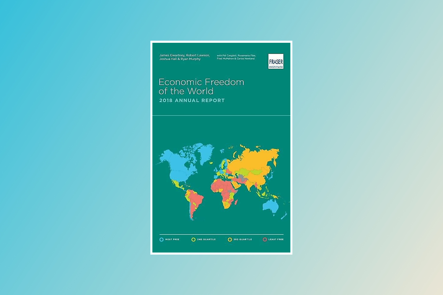
Earlier today, the Fraser Institute published the 21st edition of its annual Economic Freedom of the World (EFW) report. The Canadian think-tank uses 42 data points across five different areas (size of government, legal/property rights, sound money, freedom to trade internationally and regulation) to rank the economic freedom of 159 countries and territories.

The results? As Johan Norberg puts it, “freedom is awesome”. Which is to say that – almost without exception – the freer the country, the more rapid its economic growth, and the higher its citizens’ income.

The full report is available on the Fraser Institute’s website. But here are the key points:

America is not the real Land of the Free:

Hong Kong, despite recent political upheavals, takes the top spot – as it has since 1980. For the tenth year in a row, Singapore comes in second. New Zealand, Switzerland, Ireland, the UK, Mauritius, Georgia, Australia and Estonia make up the rest of the top 10. The United States has moved up from 13th spot to 11th. There it joins Canada, which has fallen six places. Other notable rankings are Germany in 23rd place, France in 52nd, Mexico in 76th, Russia in 100th and China in 112th place.

The freer the country, the better:

Why do the positions on the list matter? They matter because, as mentioned above, there is a high correlation between economic freedom and important indicators of human wellbeing.

The Fraser Institute splits the measured countries and territories into quartiles (i.e., each quartile represents a quarter of the samples) based on their level of economic freedom. The freest quartile has an average income that is seven times higher than that of the least free quartile ($42,463 and $6,036 respectively). Between 1990 and 2015, economic growth averaged 3.35 per cent a year in the freest quartile, whereas the least free experienced a measly 1.66 per cent growth.

It’s not just about money. In the freest nations, life expectancy is 80.7 years. This is 16.3 years more than in the bottom quartile. For many people, that amounts to a difference between knowing one’s grandchildren, or dying before their birth.

Finally, the freer the nation, the better off the poorest people in it are. The bottom 10 per cent of income earners in the freest quartile earned 11 times more than the bottom 10 per cent in the least free quartile ($11,998 per year and $1,124 per year respectively). In the freest countries, the poorest 10 per cent make almost twice as much as the average person in the least free countries.

Economic freedom isn’t just about the economy: 

For the first time, the 2017 edition of the report has adjusted its methodology to include the Gender Disparity Index (GDI). The inclusion of the index acknowledges that women are not always accorded equal treatment before the law. By using information from the World Bank’s Women, Business and Law and 50 Years of Women’s Rights projects, the Fraser authors have amended the EFW scores retrospectively.

This methodological change has meant that the Arab nations have dropped – a lot. (The report was compiled before the news broke that Saudi women will now be allowed to drive, but I don’t think it would have affected the findings much.)

In the previous report, for example, there were four Middle Eastern nations within the top 30. Now that GDI is included, not a single Arab nation ranks in the top 36. The United Arab Emirates and Qatar, which were previously the highest ranked MENA nations at 5th and 11th places respectively, are now just 37th and 45th. And the 10 countries that experienced the biggest decreases due to the GDI adjustment were all Muslim-majority nations.

The world is getting freer, faster:

This is the final and most important point to make. Despite our tendency towards pessimism about the state of the world, economic freedom has increased substantially in the last 25 years – especially in developing nations.

In 1990, the average score for a “high-income industrial” country was 7.18, compared to only 5.28 for the average “developing” country. By 2015, the average score in high-income countries was 7.76 and the average in developing countries was 6.61. The gap between the two groupings has fallen from 1.90 to 1.15 – an improvement of 40 per cent. This is thanks in large part to trade liberalisation, and the widespread conquest of inflation and introduction of sound money.

The result is that, if the 1980s world average was a nation, it would place in 154th place today – ranking between war-torn Syria and anarchic Libya. If the 2015 world average was a nation in 1980, it would be the 9th freest – with a score of 6.88, slightly above Canada at the time.

The new EFW shows that despite many anomalies and challenges, economic freedom remains deeply linked to important indicators of human wellbeing, including wealth, poverty alleviation and life expectancy. As such, it is the poorest members of the human family who get the greatest benefits from it. Long may that continue.

This first appeared in Capx. 

Blog Post | Energy & Natural Resources

The Simon Abundance Index 2024

The Earth was 509.4 percent more abundant in 2023 than it was in 1980.

The Simon Abundance Index (SAI) quantifies and measures the relationship between resources and population. The SAI converts the relative abundance of 50 basic commodities and the global population into a single value. The index started in 1980 with a base value of 100. In 2023, the SAI stood at 609.4, indicating that resources have become 509.4 percent more abundant over the past 43 years. All 50 commodities were more abundant in 2023 than in 1980.

Figure 1: The Simon Abundance Index: 1980–2023 (1980 = 100)

The SAI is based on the ideas of University of Maryland economist and Cato Institute senior fellow Julian Simon, who pioneered research on and analysis of the relationship between population growth and resource abundance. If resources are finite, Simon’s opponents argued, then an increase in population should lead to higher prices and scarcity. Yet Simon discovered through exhaustive research over many years that the opposite was true. As the global population increased, virtually all resources became more abundant. How is that possible?

Simon recognized that raw materials without the knowledge of how to use them have no economic value. It is knowledge that transforms raw materials into resources, and new knowledge is potentially limitless. Simon also understood that it is only human beings who discover and create knowledge. Therefore, resources can grow infinitely and indefinitely. In fact, human beings are the ultimate resource.

Visualizing the Change

Resource abundance can be measured at both the personal level and the population level. We can use a pizza analogy to understand how that works. Personal-level abundance measures the size of an individual pizza slice. Population-level abundance measures the size of the entire pizza pie. The pizza pie can get larger in two ways: the slices can get larger, or the number of slices can increase. Both can happen at the same time.

Growth in resource abundance can be illustrated by comparing two box charts. Create the first chart, representing the population on the horizontal axis and personal resource abundance on the vertical axis. Draw a yellow square to represent the start year of 1980. Index both population and personal resource abundance to a value of one. Then draw a second chart for the end year of 2023. Use blue to distinguish this second chart. Scale it horizontally for the growth in population and vertically for the growth in personal resource abundance from 1980. Finally, overlay the yellow start-year chart on the blue end-year chart to see the difference in resource abundance between 1980 and 2023.

Figure 2: Visualization of the Relationship between Global Population Growth and Personal Resource Abundance of the 50 Basic Commodities (1980–2023)

Between 1980 and 2023, the average time price of the 50 basic commodities fell by 70.4 percent. For the time required to earn the money to buy one unit of this commodity basket in 1980, you would get 3.38 units in 2023. Consequently, the height of the vertical personal resource abundance axis in the blue box has risen to 3.38. Moreover, during this 43-year period, the world’s population grew by 3.6 billion, from 4.4 billion to over 8 billion, indicating an 80.2 percent increase. As such, the width of the blue box on the horizontal axis has expanded to 1.802. The size of the blue box, therefore, has grown to 3.38 by 1.802, or 6.094 (see the middle box in Figure 2).

As the box on the right shows, personal resource abundance grew by 238 percent; the population grew by 80.2 percent. The yellow start box has a size of 1.0, while the blue end box has a size of 6.094. That represents a 509.4 percent increase in population-level resource abundance. Population-level resource abundance grew at a compound annual rate of 4.3 percent over this 43-year period. Also note that every 1-percentage-point increase in population corresponded to a 6.35-percentage-point increase in population-level resource abundance (509.4 ÷ 80.2 = 6.35).

Individual Commodity Changes: 1980–2023

As noted, the average time price of the 50 basic commodities fell by 70.4 percent between 1980 and 2023. As such, the 50 commodities became 238.1 percent more abundant (on average). Lamb grew most abundant (675.1 percent), while the abundance of coal grew the least (30.7 percent).

Figure 3: Individual Commodities, Percentage Change in Time Price and Percentage Change in Abundance: 1980–2023

Individual Commodity Changes: 2022–2023

The SAI increased from a value of 520.1 in 2022 to 609.4 in 2023, indicating a 17.1 percent increase. Over those 12 months, 37 of the 50 commodities in the data set increased in abundance, while 13 decreased in abundance. Abundance ranged from a 220.8 percent increase for natural gas in Europe to a 38.9 percent decrease for oranges.

Figure 4: Individual Commodities, Percentage Change in Abundance: 2022–2023

Conclusion

After a sharp downturn between 2021 and 2022, which was caused by the COVID-19 pandemic, government lockdowns and accompanying monetary expansion, and the Russian invasion of Ukraine, the SAI is making a strong recovery. As noted, since 1980 resource abundance has been increasing at a much faster rate than population. We call that relationship superabundance. We explore this topic in our book Superabundance: The Story of Population Growth, Innovation, and Human Flourishing on an Infinitely Bountiful Planet.

Appendix A: Alternative Figure 1 with a Regression Line, Equation, R-Square, and Population

Appendix B: The Basic 50 Commodities Analysis: 1980–2023

Appendix C: Why Time Is Better Than Money for Measuring Resource Abundance

To better understand changes in our standard of living, we must move from thinking in quantities to thinking in prices. While the quantities of a resource are important, economists think in prices. This is because prices contain more information than quantities. Prices indicate if a product is becoming more or less abundant.

But prices can be distorted by inflation. Economists attempt to adjust for inflation by converting a current or nominal price into a real or constant price. This process can be subjective and contentious, however. To overcome such problems, we use time prices. What is most important to consider is how much time it takes to earn the money to buy a product. A time price is simply the nominal money price divided by the nominal hourly income. Money prices are expressed in dollars and cents, while time prices are expressed in hours and minutes. There are six reasons time is a better way than money to measure prices.

First, time prices contain more information than money prices do. Since innovation lowers prices and increases wages, time prices more fully capture the benefits of valuable new knowledge and the growth in human capital. To just look at prices without also looking at wages tells only half the story. Time prices make it easier to see the whole picture.

Second, time prices transcend the complications associated with converting nominal prices to real prices. Time prices avoid subjective and disputed adjustments such as the Consumer Price Index (CPI), the GDP Deflator or Implicit Price Deflator (IPD), the Personal Consumption Expenditures price index (PCE), and the Purchasing Power Parity (PPP). Time prices use the nominal price and the nominal hourly income at each point in time, so inflation adjustments are not necessary.

Third, time prices can be calculated on any product with any currency at any time and in any place. This means you can compare the time price of bread in France in 1850 to the time price of bread in New York in 2023. Analysts are also free to select from a variety of hourly income rates to use as the denominator when calculating time prices.

Fourth, time is an objective and universal constant. As the American economist George Gilder has noted, the International System of Units (SI) has established seven key metrics, of which six are bounded in one way or another by the passage of time. As the only irreversible element in the universe, with directionality imparted by thermodynamic entropy, time is the ultimate frame of reference for almost all measured values.

Fifth, time cannot be inflated or counterfeited. It is both fixed and continuous.

Sixth, we have perfect equality of time with exactly 24 hours in a day. As such, we should be comparing time inequality, not income inequality. When we measure differences in time inequality instead of income inequality, we get an even more positive view of the global standards of living.

These six reasons make using time prices superior to using money prices for measuring resource abundance. Time prices are elegant, intuitive, and simple. They are the true prices we pay for the things we buy.

The World Bank and the International Monetary Fund (IMF) track and report nominal prices on a wide variety of basic commodities. Analysts can use any hourly wage rate series as the denominator to calculate the time price. For the SAI, we created a proxy for global hourly income by using data from the World Bank and the Conference Board to calculate nominal GDP per hour worked.

With this data, we calculated the time prices for all 50 of the basic commodities for each year and then compared the change in time prices over time. If time prices are decreasing, personal resource abundance is increasing. For example, if a resource’s time price decreases by 50 percent, then for the same amount of time you get twice as much, or 100 percent more. The abundance of that resource has doubled. Or, to use the pizza analogy, an individual slice is twice as large. If the population increases by 25 percent over the same period, there will be 25 percent more slices. The pizza pie will thus be 150 percent larger [(2.0 x 1.25) – 1].

Board of Governors of the Federal Reserve System | Economic Growth

Income Growth Over Five Generations of Americans

“We find that each of the past four generations of Americans was better off than the previous one, using a post-tax, post-transfer income measure constructed annually from 1963-2022 based on the Current Population Survey Annual Social and Economic Supplement.”

From Board of Governors of the Federal Reserve System.

Blog Post | Human Development

1,000 Bits of Good News You May Have Missed in 2023

A necessary balance to the torrent of negativity.

Reading the news can leave you depressed and misinformed. It’s partisan, shallow, and, above all, hopelessly negative. As Steven Pinker from Harvard University quipped, “The news is a nonrandom sample of the worst events happening on the planet on a given day.”

So, why does Human Progress feature so many news items? And why did I compile them in this giant list? Here are a few reasons:

  • Negative headlines get more clicks. Promoting positive stories provides a necessary balance to the torrent of negativity.
  • Statistics are vital to a proper understanding of the world, but many find anecdotes more compelling.
  • Many people acknowledge humanity’s progress compared to the past but remain unreasonably pessimistic about the present—not to mention the future. Positive news can help improve their state of mind.
  • We have agency to make the world better. It is appropriate to recognize and be grateful for those who do.

Below is a nonrandom sample (n = ~1000) of positive news we collected this year, separated by topic area. Please scroll, skim, and click. Or—to be even more enlightened—read this blog post and then look through our collection of long-term trends and datasets.

Agriculture

Aquaculture

Farming robots and drones

Food abundance

Genetic modification

Indoor farming

Lab-grown produce

Pollination

Other innovations

Conservation and Biodiversity

Big cats

Birds

Turtles

Whales

Other comebacks

Forests

Reefs

Rivers and lakes

Surveillance and discovery

Rewilding and conservation

De-extinction

Culture and tolerance

Gender equality

General wellbeing

LGBT

Treatment of animals

Energy and natural Resources

Fission

Fusion

Fossil fuels

Other energy

Recycling and resource efficiency

Resource abundance

Environment and pollution

Climate change

Disaster resilience

Air pollution

Water pollution

Growth and development

Education

Economic growth

Housing and urbanization

Labor and employment

Health

Cancer

Disability and assistive technology

Dementia and Alzheimer’s

Diabetes

Heart disease and stroke

Other non-communicable diseases

HIV/AIDS

Malaria

Other communicable diseases

Maternal care

Fertility and birth control

Mental health and addiction

Weight and nutrition

Longevity and mortality 

Surgery and emergency medicine

Measurement and imaging

Health systems

Other innovations

Freedom

    Technology 

    Artificial intelligence

    Communications

    Computing

    Construction and manufacturing

    Drones

    Robotics and automation

    Autonomous vehicles

    Transportation

    Other innovations

    Science

    AI in science

    Biology

    Chemistry and materials

      Physics

      Space

      Violence

      Crime

      War