01 / 05
Dead Wrong: An Unequal World
Blog Post | Energy & Natural Resources
The Simon Abundance Index 2024
The Earth was 509.4 percent more abundant in 2023 than it was in 1980.
The Simon Abundance Index (SAI) quantifies and measures the relationship between resources and population. The SAI converts the relative abundance of 50 basic commodities and the global population into a single value. The index started in 1980 with a base value of 100. In 2023, the SAI stood at 609.4, indicating that resources have become 509.4 percent more abundant over the past 43 years. All 50 commodities were more abundant in 2023 than in 1980.
Figure 1: The Simon Abundance Index: 1980–2023 (1980 = 100)

The SAI is based on the ideas of University of Maryland economist and Cato Institute senior fellow Julian Simon, who pioneered research on and analysis of the relationship between population growth and resource abundance. If resources are finite, Simon’s opponents argued, then an increase in population should lead to higher prices and scarcity. Yet Simon discovered through exhaustive research over many years that the opposite was true. As the global population increased, virtually all resources became more abundant. How is that possible?
Simon recognized that raw materials without the knowledge of how to use them have no economic value. It is knowledge that transforms raw materials into resources, and new knowledge is potentially limitless. Simon also understood that it is only human beings who discover and create knowledge. Therefore, resources can grow infinitely and indefinitely. In fact, human beings are the ultimate resource.
Visualizing the Change
Resource abundance can be measured at both the personal level and the population level. We can use a pizza analogy to understand how that works. Personal-level abundance measures the size of an individual pizza slice. Population-level abundance measures the size of the entire pizza pie. The pizza pie can get larger in two ways: the slices can get larger, or the number of slices can increase. Both can happen at the same time.
Growth in resource abundance can be illustrated by comparing two box charts. Create the first chart, representing the population on the horizontal axis and personal resource abundance on the vertical axis. Draw a yellow square to represent the start year of 1980. Index both population and personal resource abundance to a value of one. Then draw a second chart for the end year of 2023. Use blue to distinguish this second chart. Scale it horizontally for the growth in population and vertically for the growth in personal resource abundance from 1980. Finally, overlay the yellow start-year chart on the blue end-year chart to see the difference in resource abundance between 1980 and 2023.
Figure 2: Visualization of the Relationship between Global Population Growth and Personal Resource Abundance of the 50 Basic Commodities (1980–2023)
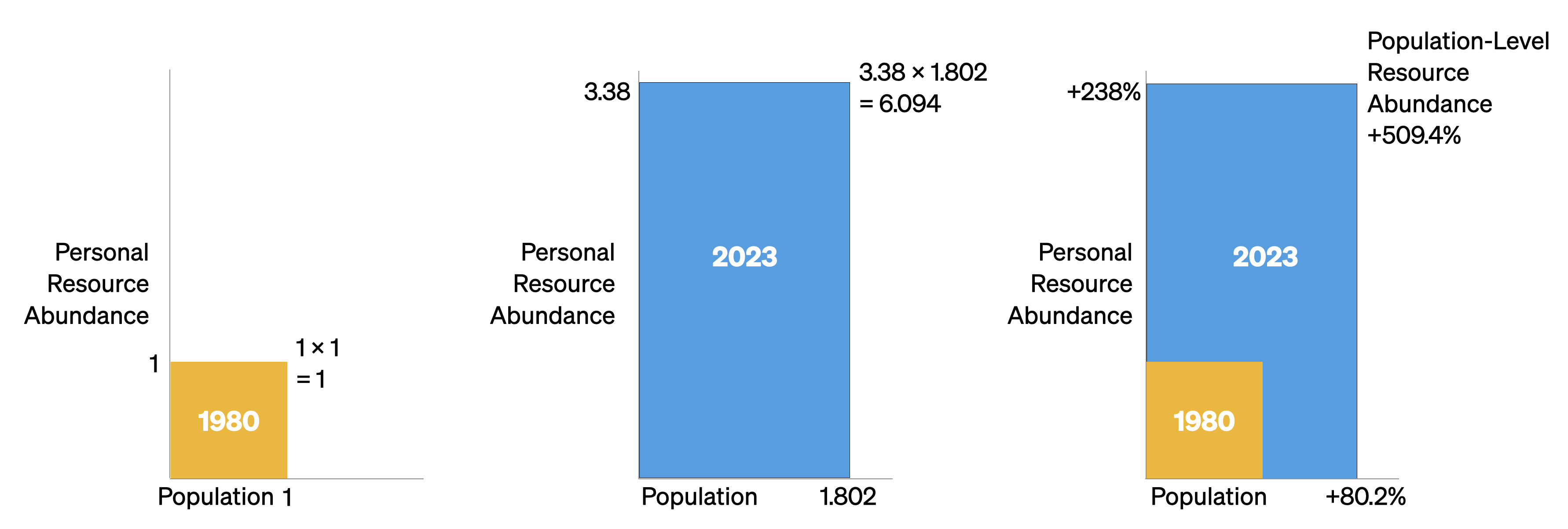
Between 1980 and 2023, the average time price of the 50 basic commodities fell by 70.4 percent. For the time required to earn the money to buy one unit of this commodity basket in 1980, you would get 3.38 units in 2023. Consequently, the height of the vertical personal resource abundance axis in the blue box has risen to 3.38. Moreover, during this 43-year period, the world’s population grew by 3.6 billion, from 4.4 billion to over 8 billion, indicating an 80.2 percent increase. As such, the width of the blue box on the horizontal axis has expanded to 1.802. The size of the blue box, therefore, has grown to 3.38 by 1.802, or 6.094 (see the middle box in Figure 2).
As the box on the right shows, personal resource abundance grew by 238 percent; the population grew by 80.2 percent. The yellow start box has a size of 1.0, while the blue end box has a size of 6.094. That represents a 509.4 percent increase in population-level resource abundance. Population-level resource abundance grew at a compound annual rate of 4.3 percent over this 43-year period. Also note that every 1-percentage-point increase in population corresponded to a 6.35-percentage-point increase in population-level resource abundance (509.4 ÷ 80.2 = 6.35).
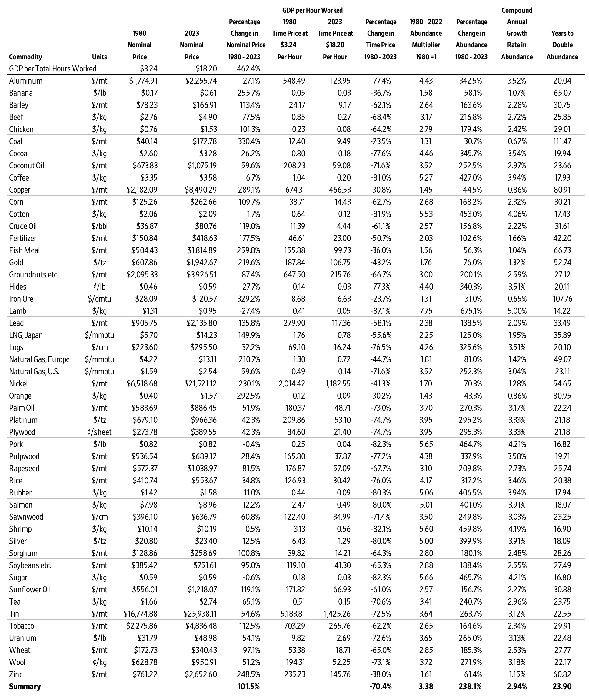
Individual Commodity Changes: 1980–2023
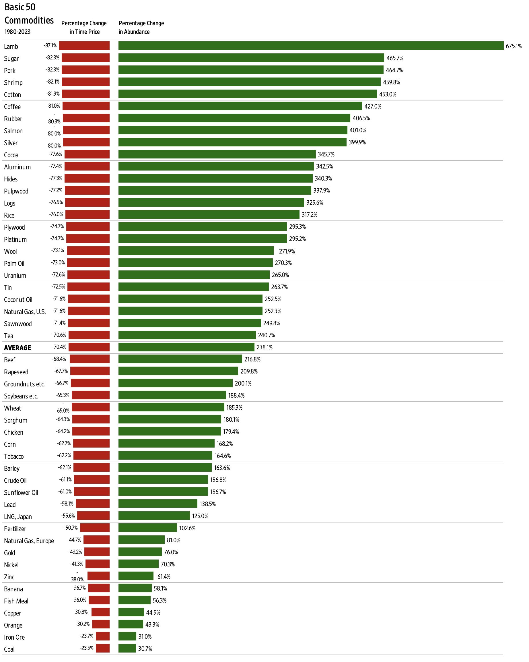
As noted, the average time price of the 50 basic commodities fell by 70.4 percent between 1980 and 2023. As such, the 50 commodities became 238.1 percent more abundant (on average). Lamb grew most abundant (675.1 percent), while the abundance of coal grew the least (30.7 percent).
Figure 3: Individual Commodities, Percentage Change in Time Price and Percentage Change in Abundance: 1980–2023
Individual Commodity Changes: 2022–2023
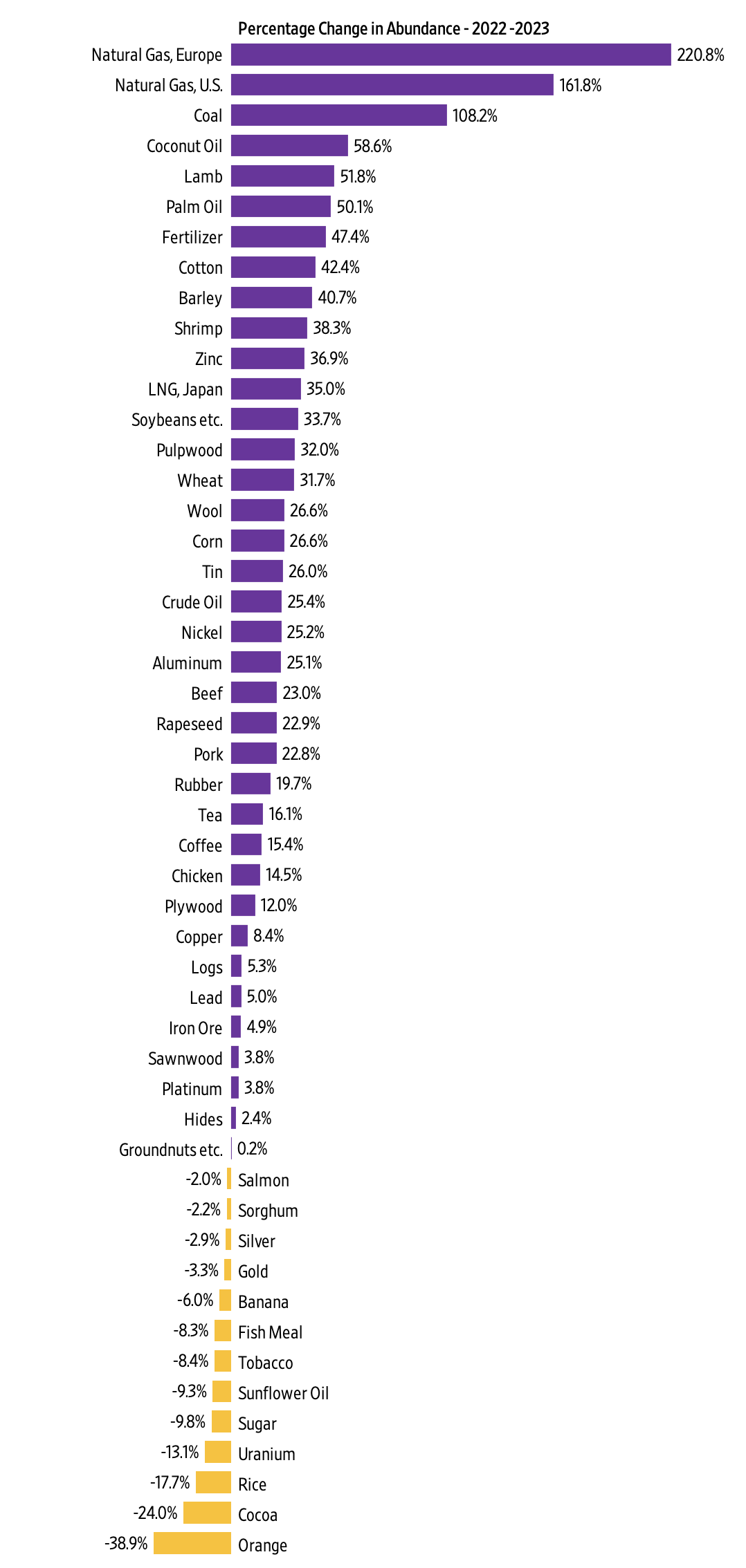
The SAI increased from a value of 520.1 in 2022 to 609.4 in 2023, indicating a 17.1 percent increase. Over those 12 months, 37 of the 50 commodities in the data set increased in abundance, while 13 decreased in abundance. Abundance ranged from a 220.8 percent increase for natural gas in Europe to a 38.9 percent decrease for oranges.
Figure 4: Individual Commodities, Percentage Change in Abundance: 2022–2023
Conclusion
After a sharp downturn between 2021 and 2022, which was caused by the COVID-19 pandemic, government lockdowns and accompanying monetary expansion, and the Russian invasion of Ukraine, the SAI is making a strong recovery. As noted, since 1980 resource abundance has been increasing at a much faster rate than population. We call that relationship superabundance. We explore this topic in our book Superabundance: The Story of Population Growth, Innovation, and Human Flourishing on an Infinitely Bountiful Planet.
Appendix A: Alternative Figure 1 with a Regression Line, Equation, R-Square, and Population

Appendix B: The Basic 50 Commodities Analysis: 1980–2023
Appendix C: Why Time Is Better Than Money for Measuring Resource Abundance
To better understand changes in our standard of living, we must move from thinking in quantities to thinking in prices. While the quantities of a resource are important, economists think in prices. This is because prices contain more information than quantities. Prices indicate if a product is becoming more or less abundant.
But prices can be distorted by inflation. Economists attempt to adjust for inflation by converting a current or nominal price into a real or constant price. This process can be subjective and contentious, however. To overcome such problems, we use time prices. What is most important to consider is how much time it takes to earn the money to buy a product. A time price is simply the nominal money price divided by the nominal hourly income. Money prices are expressed in dollars and cents, while time prices are expressed in hours and minutes. There are six reasons time is a better way than money to measure prices.
First, time prices contain more information than money prices do. Since innovation lowers prices and increases wages, time prices more fully capture the benefits of valuable new knowledge and the growth in human capital. To just look at prices without also looking at wages tells only half the story. Time prices make it easier to see the whole picture.
Second, time prices transcend the complications associated with converting nominal prices to real prices. Time prices avoid subjective and disputed adjustments such as the Consumer Price Index (CPI), the GDP Deflator or Implicit Price Deflator (IPD), the Personal Consumption Expenditures price index (PCE), and the Purchasing Power Parity (PPP). Time prices use the nominal price and the nominal hourly income at each point in time, so inflation adjustments are not necessary.
Third, time prices can be calculated on any product with any currency at any time and in any place. This means you can compare the time price of bread in France in 1850 to the time price of bread in New York in 2023. Analysts are also free to select from a variety of hourly income rates to use as the denominator when calculating time prices.
Fourth, time is an objective and universal constant. As the American economist George Gilder has noted, the International System of Units (SI) has established seven key metrics, of which six are bounded in one way or another by the passage of time. As the only irreversible element in the universe, with directionality imparted by thermodynamic entropy, time is the ultimate frame of reference for almost all measured values.
Fifth, time cannot be inflated or counterfeited. It is both fixed and continuous.
Sixth, we have perfect equality of time with exactly 24 hours in a day. As such, we should be comparing time inequality, not income inequality. When we measure differences in time inequality instead of income inequality, we get an even more positive view of the global standards of living.
These six reasons make using time prices superior to using money prices for measuring resource abundance. Time prices are elegant, intuitive, and simple. They are the true prices we pay for the things we buy.
The World Bank and the International Monetary Fund (IMF) track and report nominal prices on a wide variety of basic commodities. Analysts can use any hourly wage rate series as the denominator to calculate the time price. For the SAI, we created a proxy for global hourly income by using data from the World Bank and the Conference Board to calculate nominal GDP per hour worked.
With this data, we calculated the time prices for all 50 of the basic commodities for each year and then compared the change in time prices over time. If time prices are decreasing, personal resource abundance is increasing. For example, if a resource’s time price decreases by 50 percent, then for the same amount of time you get twice as much, or 100 percent more. The abundance of that resource has doubled. Or, to use the pizza analogy, an individual slice is twice as large. If the population increases by 25 percent over the same period, there will be 25 percent more slices. The pizza pie will thus be 150 percent larger [(2.0 x 1.25) – 1].
Measuring Freedom and Flourishing | Podcast Highlights
Chelsea Follett interviews Leandro Prados de la Escosura about the long term trends in wellbeing, inequality, and freedom.

Listen to the podcast or read the full transcript here.
Let’s discuss your latest book, Human Development and the Path to Freedom.
I have spent many years working on economic performance in the long run, and while I don’t have anything against GDP, I was always uneasy with the idea of using GDP per head as a shortcut for wellbeing. GDP is a good indicator of output but a very deficient indicator of wellbeing.
Most economists say, “This is true, but it’s highly correlated with non-economic dimensions of wellbeing.” There is also a tendency to produce a dashboard of indicators, basically GDP and some additional measures that create a more nuanced picture.
I was unhappy with that. Then I realized that, since the beginning of modern national accounts in the 1950s, there have been attempts to produce alternative measures. More than 30 years ago, the United Nations Development Programme produced the Human Development Index. I was very interested, but at the same time, I was frustrated when I saw that countries with no freedom at all ranked very highly in the index.
For example, in the first report in 1990, they had a retrospect going back to 1975, and I found that Spain, under Franco’s dictatorship, ranked very highly in human development. How come? It wasn’t satisfactory to rank a nasty dictatorship so highly. And then I read the literature accompanying the report and found this very candid assertion: “The purpose of human development is to increase people’s range of choices. If they are not free to make those choices, the entire process becomes a mockery.”
This is an important philosophical point: Human development is not just about living longer or having a higher material standard of living. You can get that in a high-security prison in Norway. Choosing between alternative ways of life is what makes the difference.
To make a long story short, they have tried time and again to introduce freedom, but they never managed to do so because of strong political opposition from country members of the program. So, as an independent scholar, I thought, “Look, nobody is going to read it, but I have the freedom to introduce the freedom dimension.”
Tell me about what you found.
Perhaps what makes sense is to compare what I found to what you would get on the basis of per capita income. If you look at the average increase from 1870 to 2020, the growth in income and wellbeing is very similar.
But if you look closer, you realize there are large differences across different periods. During first globalization before 1913 and between 1970 and 2000, they are relatively close. During the last two decades, the difference is huge in favor of material living standards measured by per capita income. The first part of the 20th century is just the opposite.
What next? Well, try to provide an explanation.
I went in two steps. One was asking, “Why has this growth in human wellbeing happened? What is the intuition?” The intuition is that if you get richer, you’re going to become better fed, healthier, better educated, and freer. But you can also have different levels of wellbeing at the same income level, and the most important finding from a historical perspective is that at any point of income, you have higher wellbeing today than in the past.
If you compare 1870 to 1913, you see that for most of the income levels, you get the same association between health and income, but at high levels of income, you get higher levels of health. Improvements in health techniques and medical knowledge were restricted to the most advanced countries. But if you look at the 1950s, at any income level, you get higher levels of health than in 1913 or 1870. You also find this for education and freedom. If you move to 2000, there is another upward shift.
Of course, there are reversals. There have been four moments in time in which the progression, the positive progression of human development stopped or declined. One was the Great Depression. The second one was during Mao’s Great Leap Forward. Then there were the oil shocks in the early ’70s, but the most damaging one has been COVID. COVID is the first period in which wellbeing measured in terms of augmented human development has declined
However, over the long run, for any income level, whether you are rich or poor, nowadays you have higher wellbeing than in the past.
Those findings are fascinating. What would you say is the biggest implication of your work?
The first thing is that wellbeing, broadly defined, has expanded worldwide more steadily than per capita income.
Secondly, the phases in which we conventionally associate improvements in wellbeing are not necessarily the same as those in which actual wellbeing improved. For instance, there was an important improvement in the so-called interwar period, even though economic growth stagnated. In 20th-century India, before independence, there was a stagnation in real average income but a remarkable improvement in health. This was because of the discovery of the germ theory of disease, which brought simple hygienic practices like washing your hands before eating and not sleeping near animals.
We also tend to forget that the association between wellbeing and income is not fixed. There are movements along the function: if you are richer, other things being equal, you’re going to be healthier, more educated, and freer. But this is not the whole story. There are also upward and downward shifts.
For instance, you could say that in terms of freedom in 2020, we are worse off than we were 20 years ago. This doesn’t mean that people were richer 20 years ago—we’re richer now—but at the same income level, 20 years ago, people were freer than we are today.
So, it’s a nuanced picture. Overall, things are improving, but there are also worrying declines in freedom.
Exactly.
Can you talk about inequality?
In 1870, in the case of wellbeing, inequality was high, and it increased up to the end of the century, then went down. Then, because of World War I, it increased again. But from the late 1920s to the present, with the exception of a reversal because of World War II, there has been a steady decline in inequality of wellbeing.
In the case of per capita income, inequality increased until the end of the 20th century, around 1980, and only began declining after 1990.
Here, I’m referring to relative inequality. If we increase wealth by 10 percent everywhere, inequality in relative terms doesn’t change. Some people are a bit pickier and think, “If my income increases 10 percent and my income is 100, I get 110. If your income is 1000, you now get 1100.” This is absolute inequality.
Relative inequality in per capita income increased until 1980 and has declined since 1990. But absolute inequality in per capita income, the distance between rich and poor, continues growing.
Absolute inequality in wellbeing has declined since 1960. Today, it is similar to what you would find in 1938, 1913, or 1900, but higher than in 1870.
It’s also important to look at what happens to different parts of the distribution. Who are the winners and losers? Broadly speaking, the middle class of the world gained the most, and the lower classes and those at the top won relatively less. If you look at absolute gains, those who were at a higher level of wellbeing got more. But that changes for different dimensions. Those at the bottom, for example, were the main winners in terms of education, while those in the middle were the main winners in terms of health.
I know that your current focus is on freedom. Could you tell me a little bit about that?
I became interested in human development after reading Amartya Sen, who emphasizes what Isaiah Berlin would call positive freedom. Freedom to. But he also emphasizes negative freedom, the absence of coercion and interference. And I think this is interesting because many people think there is a trade-off between negative and positive freedom.
At the end of the day, everybody wants to have negative freedom, but there are those who think negative freedom has nothing to do with income, that would be Hayek, and those who think negative freedom can only be reached as a second stage once you provide for those who don’t have access. For some, positive freedom is a socialist lie to reduce negative freedom. For others, they are two faces of the same coin.
As an economic historian, I find this is an interesting topic for research. If you look at the world, and you can see this in the Human Freedom Index that Cato publishes, you see the countries at the top in terms of negative freedom are also at the top in terms of positive freedom. For instance, Denmark is at the top of the list in terms of economic freedom, but also in terms of education and health.
My question was, well, maybe this trade-off is only a short-run phenomenon. Maybe if you look at the long run, the trade-off doesn’t hold or only holds for a certain period. So why not construct two alternative sets of estimates, one for positive freedom and the other for negative freedom? And this is what I’m trying to do now.
My main discrepancy with the Fraser Institute economic freedom index is that I don’t take into account the size of government. I know this is a contentious issue. People say, “the larger the government, the less room for private initiative.” At a point in time, this is true. And if you look at similarly developed countries, this is true.
But if you take a cross-section at a point in time, you can see that there are countries in which the size of government is much, much smaller, that are not necessarily freer, in terms of absence of coercion and interference, than countries with larger governments. Look at, for instance, Latin American and Sub-Saharan African countries. Think of Somalia. Or think of my own country under Franco. It was a right-wing, but, in many aspects, very socialist dictatorship in which the government was everywhere. But the size of government was very small.
In 1980, do you know what percentage the income tax contributed to the revenues of the central government in Spain? Give me a figure. You would say 40 percent?
Sure, 40 percent.
2 percent.
Wow.
Nobody paid income tax. So, there was no redistribution.
My point is that the size of government matters less than the nature of government. Perhaps Denmark would have more economic freedom with a smaller government, but if you compare Denmark to other countries, you can see that even though the Danish government is larger, Denmark’s degree of economic freedom is higher. Why? Because the nature of government action is different. It doesn’t interfere as much as another government that is less intrusive in quantitative terms but more intrusive in qualitative terms.
So, if you are looking at a point in time, it makes sense to say, “mutatis mutandis, if a rich country nowadays has a smaller government, this country is going to be freer.” That is true. But the action of government varies from one case to another.
Get Leandro Prados de la Escosura’s book, Human Development and the Path to Freedom: 1870 to the Present, here.
The Human Progress Podcast | Ep. 48
Leandro Prados de la Escosura: Measuring Freedom and Flourishing
Leandro Prados de la Escosura, an emeritus professor of economic history at Carlos III University in Spain, joins Chelsea Follett to discuss long term trends in wellbeing, inequality, and freedom. To see the slides that accompany the interview, watch the video on YouTube.

Board of Governors of the Federal Reserve System | Economic Growth
Income Growth Over Five Generations of Americans
“We find that each of the past four generations of Americans was better off than the previous one, using a post-tax, post-transfer income measure constructed annually from 1963-2022 based on the Current Population Survey Annual Social and Economic Supplement.”