Inequality can sometimes be a reflection of some social ills. But it can be a reflection of social progress too, and some purported cures for it are much worse than the disease.
Ryan Bourne —
When the Pope tweeted in 2014 that “Inequality is the root of social evil,” his stock rose with egalitarians. Former US president Barack Obama had described inequality as “the defining challenge of our time”. Jeremy Corbyn has since risen, demanding an economic policy to tackle Britain’s “grotesque inequality”. The assumption underpinning these views is that a concentrated distribution of income or wealth has negative economic and social consequences.
The idea that more inequality is a bad thing and less inequality a good thing permeates public debate. It is the moral foundation of Corbyn’s call for extensive government redistribution of income and wealth.
But according to Nobel Prize-winning economist Angus Deaton, worrying about whether inequality causes problems, such as slower growth or impaired democracies, looks at things through the wrong end of the telescope. “Inequality is not so much a cause of economic, political, and social processes as a consequence,” he concludes.
Inequality can sometimes be a reflection of some social ills. But it can be a reflection of social progress too, and some purported cures for it are much worse than the disease.
This makes sense. A given distribution of income or wealth does not fall manna from heaven, nor is it pre-determined by government. It is a reflection of millions of interactions, trades, decisions, inheritances and policies. A Gini coefficient, or a statistic of the income or wealth share for the top 1pc, is aggregate information, but tells us nothing about how it has arisen. Whether we consider the overall result “fair” or “unfair” depends, as Deaton acknowledges, on its causes.
High levels of inequality, as seen in countries such as South Africa, can be indicative of historical injustices. They can result from prejudice and oppression, past and present. They can arise from government capture by special interest groups, cronyism and corruption. Poor education, family breakdown, racial discrimination, long-term unemployment and social immobility might all lead to a concentration of income at the top.
On the other hand, there are some causes of inequality that are benign, such as lotteries, and others which are positively beneficial, such as technological advances, entrepreneurialism and free trade. Bill Gates and Steve Jobs got rich by providing services that enhanced our lives. In South Africa again, income inequality actually rose further post apartheid, because talented black people had opportunities opened to them for the first time. Few would suggest this was undesirable.
The Chinese Gini coefficient has risen from 0.16 in 1980 to 0.55 in 2014 — a sign of rising inequality — but this has gone hand in hand with huge poverty reduction as the country liberalized markets. In contrast, Britain saw a modest fall in inequality after a catastrophic financial crash in 2008. In Britain, greater equality was a symptom of a problem. In China, greater inequality was a symptom of success. It would take an extreme relativist to argue that Britain had become better and China had become worse.
Low levels of inequality can result from other undesirable trends too. In a magisterial work, Walter Scheidel’s book The Great Leveller shows that large reductions in economic inequality have only been achieved through pandemics, mass mobilization war, violent revolution and state failure. The Black Death in Europe wiped out a quarter of the population, leading to a shortage of labor relative to land, and a compression of incomes between laborers and landowners.
The Soviet Union, after the nationalization of banks, forcible redistribution of land, the gulags et al, had a Gini coefficient of just 0.26 by the Eighties — an egalitarian’s dream. In Japan, the top 1pc’s income share fell from 9.2pc to 1.9pc between 1938 and 1945, while the wealth of the largest 1pc of estates fell by 90pc. It should seem obvious that the price of lower inequality in all these cases — whether death, destruction or severe restrictions on freedom — were intolerably high.
The point here is not to say more inequality is a “good thing,” but that it cannot be generalized that less inequality is better. Corbyn’s position, that implies “reducing inequality” is desirable, seemingly countenances policies that by other metrics might be extremely harmful. We should bear this in mind when talking about the government “curbing inequality”. Affecting a distribution inevitably means interfering with human action. We could lower inequality (at least temporarily) by deporting or exterminating rich people. But would this benefit those who remained? It is difficult to see how.
Deaton is right to say then that current political trends are not so much a reflection of inequality, but perceived unfairness. He concludes: “Some of the processes that generate inequality are widely seen as fair. But others are deeply and obviously unfair, and have become a legitimate source of anger and disaffection.” No doubt there are steps the Government could take to make the economy fairer, which might also lower inequality. Liberalizing planning laws to allow more houses to be built, for example, would almost certainly narrow the wealth distribution but would improve the efficiency of the economy too.
Yet what Deaton’s argument really shows is that we should not care about inequality at all. Once one starts thinking about the need to eliminate “bad” causes of inequality, while leaving “good” causes alone, you are not really acting on inequality, but the justness or otherwise of other things that affect it. We should eliminate crony capitalism, prevent taxpayer bank bailouts, and ensure competitive markets that the public want for efficiency and fairness reasons, irrespective of their effect on inequality measures such as the Gini coefficient.
At best, inequality serves as an indicator of potential problems. At worst, obsessing about it distorts our priorities from what truly matters, such as the living standards of the least well-off. Inequality can sometimes be a reflection of some social ills. But it can be a reflection of social progress too, and some purported cures for it are much worse than the disease.
Thanksgiving Dinner Will Be 8.8 Percent Cheaper This Year
Be thankful for the increase in human knowledge that transforms atoms into valuable resources.
Gale L. Pooley —
Summary: There has been a remarkable decrease in the “time price” of a Thanksgiving dinner over the past 38 years, despite nominal cost increases. Thanks to rising wages and innovation, the time required for a blue-collar worker to afford the meal dropped significantly, making food much more abundant. Population growth and human knowledge drive resource abundance, allowing for greater prosperity and efficiency in providing for more people.
Since 1986, the American Farm Bureau Federation (AFBF) has conducted an annual price survey of food items that make up in a typical Thanksgiving Day dinner. The items on this shopping list are intended to feed a group of 10 people, with plenty of leftovers remaining. The list includes a turkey, a pumpkin pie mix, milk, a vegetable tray, bread rolls, pie shells, green peas, fresh cranberries, whipping cream, cubed stuffing, sweet potatoes, and several miscellaneous ingredients.
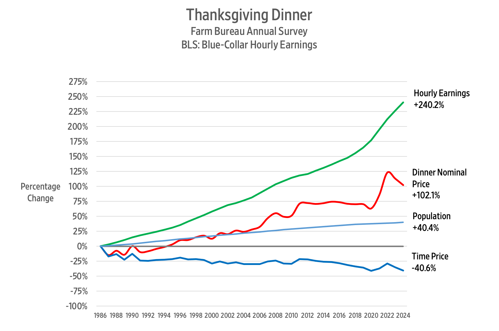
So, what has happened to the price of a Thanksgiving Day dinner over the past 38 years? The AFBF reports that in nominal terms, the cost rose from $28.74 in 1986 to $58.08 in 2024. That’s an increase of 102.1 percent.
Since we buy things with money but pay for them with time, we should analyze the cost of a Thanksgiving Day dinner using time prices. To calculate the time price, we divide the nominal price of the meal by the nominal wage rate. That gives us the number of work hours required to earn enough money to feed those 10 guests.
According to the Bureau of Labor Statistics, the blue-collar hourly wage rate increased by 240.2 percent – from $8.96 per hour in October 1986 to $30.48 in October 2024.
Remember that when wages increase faster than prices, time prices decrease. Consequently, we can say that between 1986 and 2024 the time price of the Thanksgiving dinner for a blue-collar worker declined from 3.2 hours to 1.9 hours, or 40.6 percent.
That means that blue-collar workers can buy 1.68 Thanksgiving Day dinners in 2024 for the same number of hours it took to buy one dinner in 1986. We can also say that Thanksgiving dinner became 68 percent more abundant.
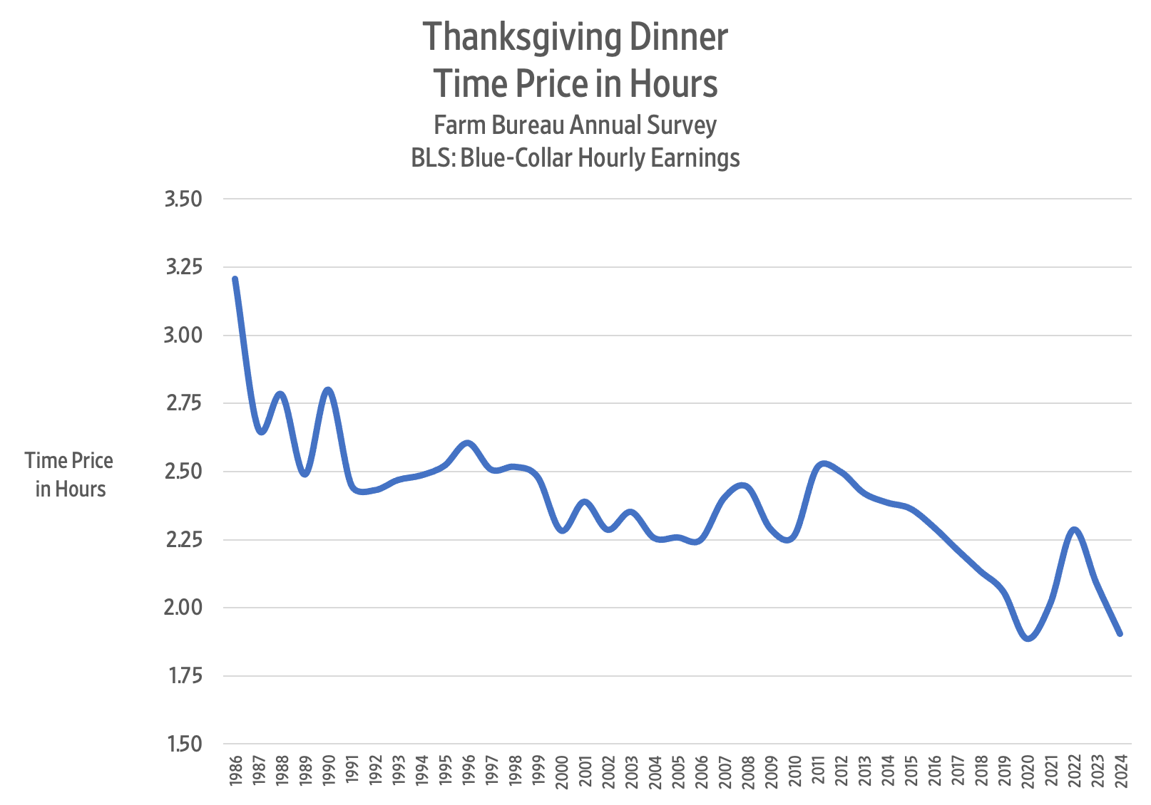
Here is a chart showing the time price trend for the Thanksgiving dinner over the past 38 years:
The lowest time price for the Thanksgiving dinner was 1.87 hours in 2020, but then COVID-19 policies struck, and the time price jumped to 2.29 hours in 2022.
In 2023, the time price of the Thanksgiving dinner came to 2.09 hours. This year, it came to 1.91 hours – a decline of 8.8 percent. For the time it took to buy Thanksgiving dinner last year, we get 9.6 percent more food this year.
Between 1986 and 2024, the US population rose from 240 million to 337 million – a 40.4 percent increase. Over the same period, the Thanksgiving dinner time price decreased by 40.6 percent. Each one percentage point increase in population corresponded to a one percentage point decrease in the time price.
To get a sense of the relationship between food prices and population growth, imagine providing a Thanksgiving Day dinner for everyone in the United States. If the whole of the United States had consisted of blue-collar workers in 1986, the total Thanksgiving dinner time price would have been 77 million hours. By 2024, the time price fell to 64.2 million hours – a decline of 12.8 million hours or 16.6 percent.
Given that the population of the United States increased by 40.4 percent between 1986 and 2024, we can confidently say that more people truly make resources much more abundant.
An earlier version of this article was published at Gale Winds on 11/21/2024.
The Typical US Worker Out-Earned Inflation by $1,400 a Year
“While higher costs for everything from milk to medicines have preoccupied U.S. consumers in the pandemic era, earnings have also risen enough, on average, to push up households’ purchasing power a bit. And blue-collar workers have been the biggest beneficiaries.
An analysis published in July by economists at the Treasury Department found that the median worker can afford the same representative basket of goods and services as they did in 2019 — plus have an additional $1,400 a year.”
“The median household net worth of older millennials, born in the 1980s, rose to $130,000 in 2022 from $60,000 in 2019, according to inflation-adjusted data from the Federal Reserve Bank of St. Louis. Median wealth more than quadrupled to $41,000 for Americans born in the 1990s, which includes the generation’s youngest members, born in 1996.
The turnaround has been so dramatic that millennials—mocked at times for being perpetually behind in building wealth, buying homes, getting married and having children—now find themselves ahead.
In early 2024, millennials and older members of Gen Z had, on average and adjusting for inflation, about 25% more wealth than Gen Xers and baby boomers did at a similar age, according to a St. Louis Fed analysis.”