Africa's Free Trade Area Could Lift Millions out of Poverty
From socialist dictatorships to free trade, the prospects for African growth are looking better than ever.
Alexander C. R. Hammond —
In recent months, African nations have been in the process of creating, signing and ratifying the African Continental Free Trade Area (AfCFTA). The agreement is one of the largest trade liberalisation efforts since the founding of the World Trade Organization in 1995.
Last Sunday, at the 31st African Union (AU) Summit in Nouakchott, Mauritania; the total number of AfCFTA’s signatories reached 49 out of 55 African Union (AU) member states. So is free trade becoming mainstream in African politics?
If all 55 AU nations ratified the proposed agreement, AfCFTA would create a trading area with 1.2 billion people and a cumulative GDP of $2.5 trillion. It aims to improve trade within the continent by immediately removing tariffs on 90 per cent of goods, with the remaining 10 per cent of tariffs on “sensitive goods” phasing out over time.
Being able to trade freely with one’s neighbours is vital for economic growth. In 2016, just 18 per cent of Africa’s total exports were traded within the African continent. In Europe and Asia, intra-regional trade accounted for 69 per cent and 59 per cent of total exports respectively.
Under the AfCFTA, the UN Economic Commission on Africa estimates, intra-African trade could increase 52.3 per cent by 2022. It could double again, after the final 10 per cent of tariffs are removed. If adopted, the AfCFTA has the potential to revolutionise African trade and add billions to the continent’s GDP.
Quality of government could also improve through competition to create welcoming and stable business environments.
For the AfCTFA to be implemented, 22 countries must ratify the agreement. So far, six have done so. Unfortunately, prior to last weekend, the AfCFTA did not have the support of the continent’s two richest nations. Whilst Nigeria remains reluctant to cooperate, South Africa, the continent’s largest economy, has finally signed the agreement.
Admittedly, the AU has a long history of failed promises and meaningless acts. If AfCTFA succeeds, it will signify an important shift away from the socialist policies of Africa’s past. As Professor George Ayittey, the president of the Free Africa Foundation, explains:
Most African nations took the socialist route after independence… In many places in Africa, capitalism was identified with colonialism, and since the latter was evil and exploitative, so too was the former. Socialism, the antithesis of capitalism, was advocated as the only road to Africa’s prosperity… and in its wake followed economic atrophy, repression and dictatorship.
Africa’s socialist experience started in Ghana, the first African colony to gain independence in 1957. Kwame Nkrumah, the man many consider to be the “Father of African socialism”, pursued “complete ownership of the economy by the state”. Nkrumah encouraged Africans to “not rest content until we demolish this miserable structure of colonialism and erect in its place veritable paradise”.
Ahmed Sekou Touré of Guinea in 1958, Modibo Keita of Mali and Leopold Sedar Senghor of Senegal in 1960, Kenneth Kaunda of Zambia in 1964 and Agostinho Neto of Angola in 1975 were just some of the leaders who followed Nkrumah’s example.
“Predictably, in one country after another, economic ruin, dictatorship and oppression followed with deadly consistency… In Africa, socialism was implemented through the one-party state apparatus. The state would own everything and direct economic activity,” explains Ayittey.
Compare Africa’s past with its present. The AfCTFA is championed by Paul Kagame, the AU’s Chairman and President of Rwanda. Kagame describes himself as an avid free-trader and a disciple of Lee Kuan Yew, the first leader of the independent free-trading nation of Singapore. He is not alone: Mahamadou Issoufou, the President of Niger, noted that mobilising his peers to sign the agreement was easy as “most leaders already wanted to create a free-trade area in Africa”. The AfCTFA will mean “more integration (and) more growth for the whole continent,” Issoufou has declared.
Beyond the AfCFTA, overall trends across the continent indicate shifting attitudes towards free enterprise.
As Marian L. Tupy of the Cato Institute notes, “Africa’s love affair with socialism persisted until the 1990s, when, at long last, Africa started to reintegrate into the global economy”. According to the Economic Freedom of World report, Africa’s economy is becoming freer – its economic freedom score is now equal to the world average in 1996.
Tupy continues: “Trade relations with the rest of the world were somewhat liberalised (after 1990), and African nations started to deregulate their economies, thus climbing up the rankings in the World Bank’s Ease of Doing Business report.”
Despite this trend towards liberalisation, many African nations continue to be rife with corruption, ruled by dictators and face persistent poverty. But the AfCTFA and the desire of 49 nations to pursue intra-African free trade is a symbol that attitudes in what was once described as “The Hopeless Continent” are changing.
From socialist dictatorships to free trade, the prospects for African growth are looking better than ever. Let’s hope this deal adds billions of dollars to the continent’s economy, lifting millions out of poverty.
Thanksgiving Dinner Will Be 8.8 Percent Cheaper This Year
Be thankful for the increase in human knowledge that transforms atoms into valuable resources.
Gale L. Pooley —
Summary: There has been a remarkable decrease in the “time price” of a Thanksgiving dinner over the past 38 years, despite nominal cost increases. Thanks to rising wages and innovation, the time required for a blue-collar worker to afford the meal dropped significantly, making food much more abundant. Population growth and human knowledge drive resource abundance, allowing for greater prosperity and efficiency in providing for more people.
Since 1986, the American Farm Bureau Federation (AFBF) has conducted an annual price survey of food items that make up in a typical Thanksgiving Day dinner. The items on this shopping list are intended to feed a group of 10 people, with plenty of leftovers remaining. The list includes a turkey, a pumpkin pie mix, milk, a vegetable tray, bread rolls, pie shells, green peas, fresh cranberries, whipping cream, cubed stuffing, sweet potatoes, and several miscellaneous ingredients.
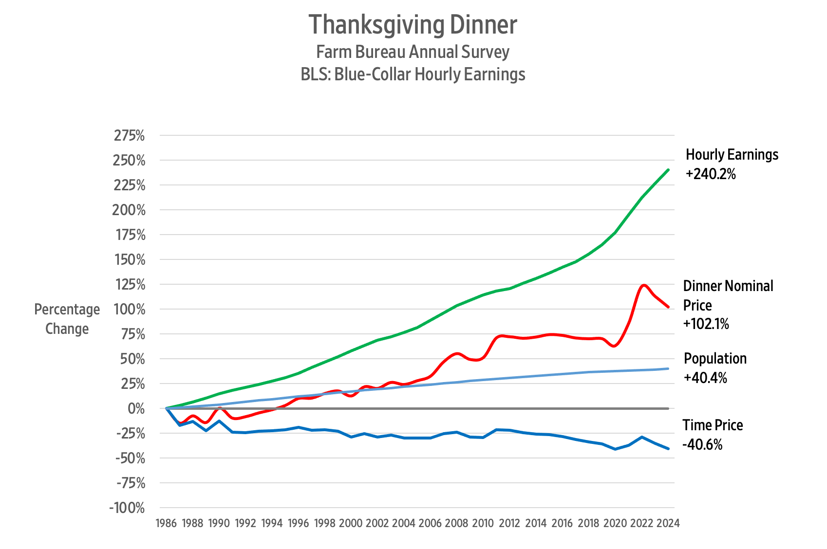
So, what has happened to the price of a Thanksgiving Day dinner over the past 38 years? The AFBF reports that in nominal terms, the cost rose from $28.74 in 1986 to $58.08 in 2024. That’s an increase of 102.1 percent.
Since we buy things with money but pay for them with time, we should analyze the cost of a Thanksgiving Day dinner using time prices. To calculate the time price, we divide the nominal price of the meal by the nominal wage rate. That gives us the number of work hours required to earn enough money to feed those 10 guests.
According to the Bureau of Labor Statistics, the blue-collar hourly wage rate increased by 240.2 percent – from $8.96 per hour in October 1986 to $30.48 in October 2024.
Remember that when wages increase faster than prices, time prices decrease. Consequently, we can say that between 1986 and 2024 the time price of the Thanksgiving dinner for a blue-collar worker declined from 3.2 hours to 1.9 hours, or 40.6 percent.
That means that blue-collar workers can buy 1.68 Thanksgiving Day dinners in 2024 for the same number of hours it took to buy one dinner in 1986. We can also say that Thanksgiving dinner became 68 percent more abundant.
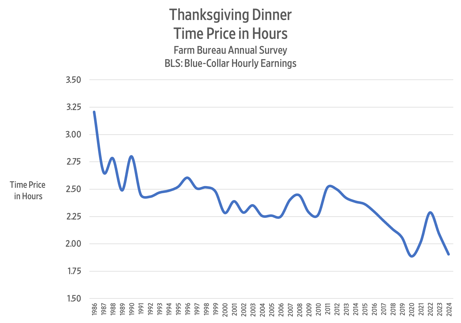
Here is a chart showing the time price trend for the Thanksgiving dinner over the past 38 years:
The lowest time price for the Thanksgiving dinner was 1.87 hours in 2020, but then COVID-19 policies struck, and the time price jumped to 2.29 hours in 2022.
In 2023, the time price of the Thanksgiving dinner came to 2.09 hours. This year, it came to 1.91 hours – a decline of 8.8 percent. For the time it took to buy Thanksgiving dinner last year, we get 9.6 percent more food this year.
Between 1986 and 2024, the US population rose from 240 million to 337 million – a 40.4 percent increase. Over the same period, the Thanksgiving dinner time price decreased by 40.6 percent. Each one percentage point increase in population corresponded to a one percentage point decrease in the time price.
To get a sense of the relationship between food prices and population growth, imagine providing a Thanksgiving Day dinner for everyone in the United States. If the whole of the United States had consisted of blue-collar workers in 1986, the total Thanksgiving dinner time price would have been 77 million hours. By 2024, the time price fell to 64.2 million hours – a decline of 12.8 million hours or 16.6 percent.
Given that the population of the United States increased by 40.4 percent between 1986 and 2024, we can confidently say that more people truly make resources much more abundant.
An earlier version of this article was published at Gale Winds on 11/21/2024.
The Typical US Worker Out-Earned Inflation by $1,400 a Year
“While higher costs for everything from milk to medicines have preoccupied U.S. consumers in the pandemic era, earnings have also risen enough, on average, to push up households’ purchasing power a bit. And blue-collar workers have been the biggest beneficiaries.
An analysis published in July by economists at the Treasury Department found that the median worker can afford the same representative basket of goods and services as they did in 2019 — plus have an additional $1,400 a year.”
“The median household net worth of older millennials, born in the 1980s, rose to $130,000 in 2022 from $60,000 in 2019, according to inflation-adjusted data from the Federal Reserve Bank of St. Louis. Median wealth more than quadrupled to $41,000 for Americans born in the 1990s, which includes the generation’s youngest members, born in 1996.
The turnaround has been so dramatic that millennials—mocked at times for being perpetually behind in building wealth, buying homes, getting married and having children—now find themselves ahead.
In early 2024, millennials and older members of Gen Z had, on average and adjusting for inflation, about 25% more wealth than Gen Xers and baby boomers did at a similar age, according to a St. Louis Fed analysis.”