fbpx
01 / 05
Ridley: Why Is It so Cool to Be Gloomy?

Blog Post | Adoption of Technology

Ridley: Why Is It so Cool to Be Gloomy?

The world is in better shape than most people think, but we're more inclined to focus on bad news than good.

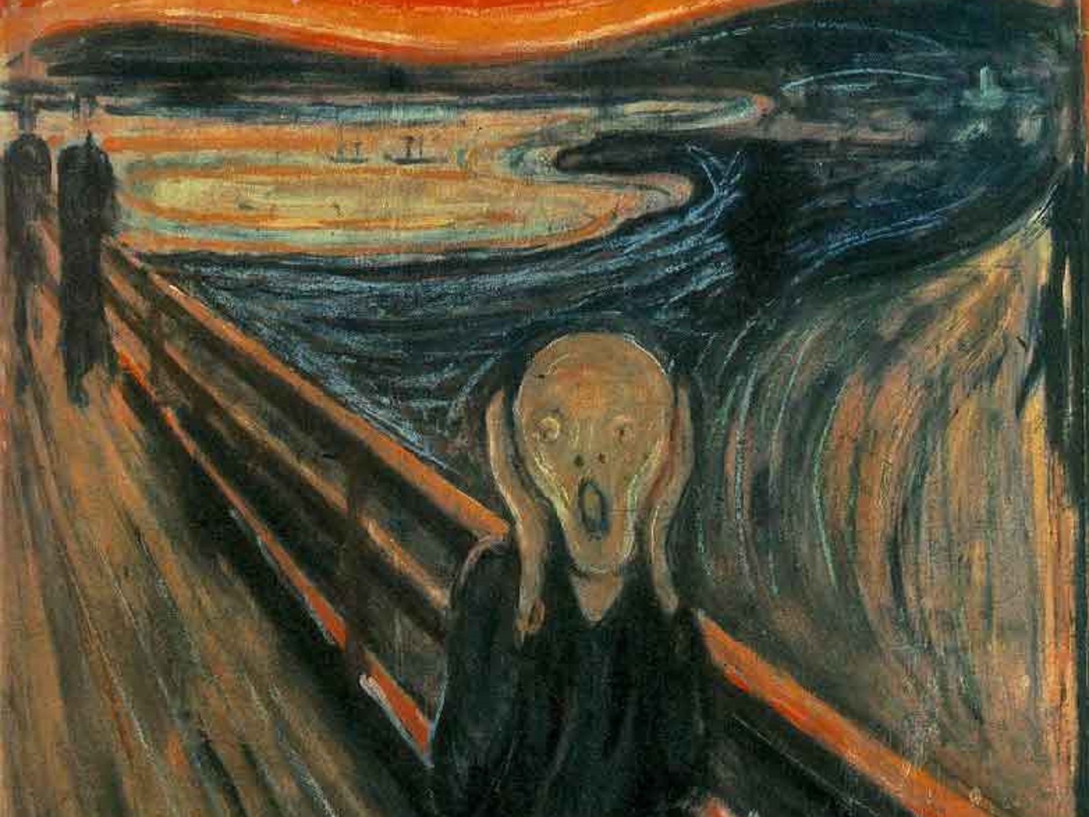
The Scream painted by artist Edvard Munch in 1893

Has the percentage of the world population that lives in extreme poverty almost doubled, almost halved or stayed the same over the past 20 years? When the Swedish statistician and public health expert Hans Rosling began asking people that question in 2013, he was astounded by their responses. Only 5% of 1,005 Americans got the right answer: Extreme poverty has been cut almost in half. A chimpanzee would do much better, he pointed out mischievously, by picking an answer at random. So people are worse than ignorant: They believe they know many dire things about the world that are, in fact, untrue.

Before his untimely death last year, Rosling (with his son and daughter-in-law as co-authors) published a magnificent book arguing against such reflexive pessimism. Its title says it all: “Factfulness: Ten Reasons We’re Wrong About the World—and Why Things Are Better Than You Think.” As the author of a book called “The Rational Optimist,” I’m happy to include myself in their platoon, which also includes writers such as Steven Pinker, Bjorn Lomborg, Michael Shermer and Gregg Easterbrook.

For us New Optimists, however, it’s an uphill battle. No matter how persuasive our evidence, we routinely encounter disbelief and even hostility, as if accentuating the positive was callous. People cling to pessimism about the state of the world. John Stuart Mill neatly summarized this tendency as far back as 1828: “I have observed that not the man who hopes when others despair, but the man who despairs when others hope, is admired by a large class of persons as a sage.” It’s cool to be gloomy.

Studies consistently find that people in developed societies tend to be pessimistic about their country and the world but optimistic about their own lives. They expect to earn more and to stay married longer than they generally do. The Eurobarometer survey finds that Europeans are almost twice as likely to expect their own economic prospects to get better in the coming year as to get worse, while at the same time being more likely to expect their countries’ prospects to get worse than to improve. The psychologist Martin Seligman of the University of Pennsylvania suggests a reason for this: We think we are in control of our own fortunes but not those of the wider society.

There are certainly many causes for concern in the world today, from terrorism to obesity to environmental problems, but the persistence of pessimism about the planet requires some explanation beyond the facts themselves. Herewith a few suggestions:

Bad news is more sudden than good news, which is usually gradual.

Therefore bad news is more newsworthy. Battles, bombings, accidents, murders, storms, floods, scandals and disasters of all kinds tend to dominate the news. “If it bleeds, it leads,” as they used to say in the newspaper business. By contrast, the gradual reduction in poverty in the world rarely makes a sudden splash. As Rosling put it, “In the media the ‘newsworthy’ events exaggerate the unusual and put the focus on swift changes.”

This is part of what psychologists call the “availability bias,” a quirk of human cognition first noticed by Amos Tversky and Daniel Kahneman in the 1970s. People vastly overestimate the frequency of crime, because crime disproportionately dominates the news. But random violence makes the news because it is rare, whereas routine kindness doesn’t make the news because it is so common.

Bad news usually matters; good news may not.

In the prehistoric past, it made more sense to worry about risks—it might help you avoid getting killed by a lion—than to celebrate success. Perhaps this is why people have a “negativity bias.” In a 2014 paper, researchers at McGill University examined which news stories their subjects chose to read for what they thought was an eye-tracking experiment. It turns out that even when people say they want more good news, they are more interested in bad news: “Regardless of what participants say, they exhibit a preference for negative news content,” concluded the authors Mark Trussler and Stuart Soroka.

People think in relative not absolute terms.

What matters is how well you are doing relative to other people, because that’s what determined success in the competition for resources (and mates) in the stone age. Being told that others are doing well is therefore a form of bad news. When circumstances get better, people take those improvements for granted and reset their expectations.

Such relativizing behavior affects even our most intimate relationships. An ingenious 2016 study by David Buss and colleagues at the University of Texas at Austin found that “participants lower in mate value than their partners were generally satisfied regardless of the pool of potential mates; participants higher in mate value than their partners became increasingly dissatisfied with their relationships as better alternative partners became available.” Ouch.

As the world improves, people expand their definition of bad news.

This recent finding by the Harvard psychologists David Levari and Daniel Gilbert, known as “prevalence-induced concept change,” suggests that the rarer something gets, the more broadly we redefine the concept. They found in an experiment that the rarer they made blue dots, the more likely people were to call purple dots “blue,” and the rarer they made threatening faces, the more likely people were to describe a face as threatening. “From low-level perception of color to higher-level judgments of ethics,” they write, “there is a robust tendency for perceptual and judgmental standards to ‘creep’ when they ought not to.”

Consider air travel: Plane crashes have been getting steadily scarcer—2017 was the first year with no commercial passenger plane crashes at all, despite four billion people in the air—but each one now receives vastly more coverage. Many people still consider planes a risky mode of transport.

We’re even capable of fretting about the bounty of prosperity, as “Weird Al” Yankovic highlights in his clever song, “First World Problems”: “The thread count on these cotton sheets has got me itching/My house is so big, I can’t get Wi-Fi in the kitchen.” Sheena Iyengar of Columbia Business School became a TED star for her research on the debilitating modern illness known as the “choice overload problem”—that is, being paralyzed by having to choose from among, say, the dozens of types of olive oil or jam on offer at the grocery store. North Koreans, Syrians, Congolese and Haitians generally have more important things to worry about.

Other psychological effects apply as well. There is a tendency to remember the good things about the past and to forget the bad, a phenomenon known as the “reminiscence bump”: People have rosy nostalgia about the days of their youth, whatever it was actually like. There is also the vested interest that pressure groups have in selling bad news in exchange for donations.

Finally, there is what I call “turning-point-itis.” This is the tendency to think that things may have improved in the past but will no longer do so in the future, because we stand at a turning point in history. It’s true, as brokers like to say, that past performance is no guide to future performance. But as the historian Lord Macaulay wrote almost two centuries ago, “On what principle is it that with nothing but improvement behind us, we are to expect nothing but deterioration before us?”

So cheer up. The world’s doing better than you think.

This first appeared in the Wall Street Journal.

International Labour Organization | Income Inequality

Wage Inequality Declined in Most Countries Since Start of 21st Century

“The Global Wage Report 2024-25 finds that since the early 2000’s, on average, wage inequality, which compares the wages of high and low wage earners, decreased in many countries at an average rate that ranged from 0.5 to 1.7 per cent annually, depending on the measure used. The most significant decreases occurred among low-income countries where the average annual decrease ranged from 3.2 to 9.6 per cent in the past two decades. 

Wage inequality is declining at a slower pace in wealthier countries, shrinking annually between 0.3 and 1.3 per cent in upper-middle-income-countries, and between 0.3 to 0.7 per cent in high-income countries”

From International Labour Organization.

Blog Post | Income & Inequality

Myths About American Inequality | Podcast Highlights

Chelsea Follett interviews John Early about popular misconceptions around inequality in the United States and the measurement errors behind them.

Listen to the podcast or read the full transcript here. To see the slides that accompany the interview, watch the video on YouTube or the Spotify app.

So, let’s start with your book, The Myth of American Inequality: How Government Biases Policy Debate. Why is everything that most people think they know about income, inequality, poverty, and other measures of economic well-being in America dead wrong?

In some ways, this is perhaps a somewhat boring answer about facts, but that’s what makes it important; we have to get the facts straight. The numbers that people’s opinions are based on are not correct. There are various ways in which they aren’t, but two big ones.

The first is that when the US census measures income, it doesn’t count two-thirds of what are called transfer payments, or money that the government gives to people for not doing anything. In other words, a transfer payment is not what we pay civil servants or the military. Transfer payments are things like food stamps or Medicaid, which are also two examples of things that the census does not count. They also don’t count 88 percent of the transfer payments that go to people who are classified as poor. They don’t count Medicare for the senior population. They don’t count what is called Supplemental Security Income. They don’t count many state and local transfer payments to poor people. They count some housing subsidies, the so-called Section 8 subsidies, but they don’t count others.

When you add all the pieces up, two-thirds of the total amount of transfer payments aren’t counted. So that’s one big piece.

The other big piece is they don’t adjust for taxes. At the bottom end of the income scale, people pay about seven and a half percent of their income in taxes, mostly sales taxes and excise taxes. At the upper end of the income scale, people pay between 35 and 40 percent of their income in taxes, mostly income taxes. So, if you don’t adjust for those taxes, you end up with a very skewed view of the income distribution.

The census splits US households into five groups based on income. The bottom quintile has the least income, and the top quintile has the most. Using the official census definition of income, the ratio between the top and the bottom is 16.7 to 1, so the top quintile has 16.7 times more income than the bottom.

Now, the first thing we did was ask what income was missing. Well, the first thing we found that was missing was capital gains. Capital gains are not counted as income for reasons that aren’t clear. That, of course, is missing mostly from the top half of the income distribution. At the low end of the distribution, there’s all sorts of income misreporting. Not terribly large, but there is some, people just don’t report all their income. And in the middle, employer-paid benefits are missing. So, adding all that earned income data made the ratio between the top and bottom much bigger. The top quintile earns 60 times more income than the bottom quintile.

But we’re still missing two-thirds of the transfer payments. If we add all the transfer payments, the difference between the top and bottom drops to 5.7 to 1.

So that’s all the money coming in, but the census also ignores the money the government takes through taxes. If we compare after-tax income and after-transfer payment income, the difference drops to only 4 to 1.

So, we’ve gone from 16.7 to 1 to 4 to 1 after counting all the money. We didn’t have to redefine anything.

Let me hit a couple of other points here.

It’s not only that the difference between the top and the bottom became smaller after adding all the income data and accounting for taxes. The differences between the bottom, the next to the bottom, and the middle virtually disappear. The bottom 60 percent of Americans all have almost the same amount of income. Let me explain that a bit.

Income in the second quintile is only 8 percent larger than in the bottom quintile. And yet there are 2.8 times more people working in second quintile households. And when they work, they work 1.8 times more hours. They work nearly 40 hours, and people in the bottom quintile work less than 20. And in the middle quintile, there is 32 percent more income, but over three times more people are working, and they work more than twice as many hours. They put out a whole lot more effort and don’t get much more income.

Now, there’s another important wrinkle: adjusting households for size. Households in the bottom quintile tend to be single individuals, retired individuals, people who’ve just graduated from college, and so on. Households become larger as you go up the income scale. When you adjust for size, the bottom quintile actually receives 5 percent more income than the second quintile does. And only 7 percent less than the middle.

There’s also the issue of change over time. There’s something called the Gini coefficient. It’s a measure that’s set up so that at zero, you have perfect equality. Every household has the same income. And at 1, all the income is in one household. The census publishes this measure, and it has risen over the long term. When President Obama or Chuck Schumer says income inequality is awful and it’s getting worse, this is what they’re referring to. But they don’t count all the transfer payments, which have gone from being like 10 percent of our federal budget to 75 percent over time. If you count all the transfers and take away the taxes, the Gini coefficient has actually fallen.

There’s also the question of economic mobility. In a previous paper, you found that two-thirds of children reared in the lowest quintile at some point escape to a higher quintile as adults. I don’t think people realize just how economically mobile Americans are.

Your last point there is really important. Almost all income distribution data are a slice in time. So, the statement that “the poor are getting poorer and the rich are getting richer” is just wrong because these categories are not static: people who were poor ten years ago are rich today, and some previously rich folks have fallen into lower income levels. Now, there are studies that track the same people through time, and during one’s lifetime, you generally move up. Almost everyone’s income goes up, except for those who choose not to participate in the labor force. Although their income goes up too because we keep raising the transfer payments.

The same also applies to income groups. In 1967, the top quintile of households were those that made around $60,000 or more in 2017 dollars. The people in the bottom quintile made between zero and $15,000 in 2017 dollars. In 2017, 77 percent of the population was making incomes that would have placed them in the top quintile 50 years earlier. That’s inflation-adjusted. And fewer than 2 percent of the people in the bottom quintile in 2017 would have been in the bottom quintile 50 years ago. So, throughout the income distribution, we’re all a whole lot better off.

Now, are we better off than five years ago? Well, some of us are, and some of us aren’t, but the overwhelming majority of us are better off than our parents and grandparents were. Far better off.

What is another hopeful fact about the US economy right now that people may not be aware of?

If you measure it right, the share of Americans in poverty has dropped from about 14 percent back when the war on poverty began to 1.1 percent.

So, when Lyndon B. Johnson declared the war on poverty in 1964, the poverty rate had declined from over 30 percent in the 1940s and 50s to around 17 percent. Now, what happened after that? Well, poverty continued to decline at the same rate for another four or five years. Then, it stopped going down and started rising and falling with the business cycle.

Why do you suppose that happened?

Mismeasurement.

Exactly. We declared a war on poverty. We started giving people a lot of money, but we didn’t measure that money as income. And so, it bounced between 11 percent and 15 percent, back and forth, back and forth. It dropped below 11 percent last year, but it’s still in the same range. But if we count all the transfer payments, it’s only 2.5 percent. And if we correct for the CPI overstating inflation, poverty would be less than 2 percent.

So, poverty has virtually disappeared. The people in that 2 percent are people who are especially challenged, either mentally or physically, and they may need help. But most people who are called poor are simply getting lots of money from the government, and they’re not poor anymore.

Johnson had two objectives for the war on poverty. One was to alleviate the suffering of those who were poor, but the other was to enable them to become productive citizens. We completely failed at that one. Only one third of work-age adults in the bottom quintile have a job. Back when Johnson started the war on poverty, two-thirds of them did.

Why? The government’s paying them to do nothing. So, they do nothing.

Get John Early’s book, The Myth of American Inequality: How Government Biases Policy Debate, here.

The Human Progress Podcast | Ep. 55

John Early: Myths About American Inequality

John Early, a mathematical economist and adjunct scholar at the Cato Institute, joins Chelsea Follett to discuss popular misconceptions about inequality in the United States and the measurement errors behind them. To see the slides that accompany the interview, watch the video on YouTube or the Spotify app.