fbpx
01 / 05
The Growing Abundance of Finished Goods: 1971-2024

Blog Post | Cost of Material Goods

The Growing Abundance of Finished Goods: 1971-2024

1971 did not mark the beginning of an overall decline in US standards of living.

Summary: Productivity, competition, and innovation have dramatically reduced the “time price” of consumer goods in the United States since 1971. The time required for a blue-collar worker to afford 75 finished goods has fallen dramatically, increasing the personal abundance available to these workers. This trend highlights the power of markets to enhance prosperity far beyond population growth, underscoring the importance of preserving economic freedom.


The website “WTF Happened in 1971?” highlights a collection of economic charts that purport to show a marked divergence in various economic, social, and financial metrics starting around 1971. The main argument presented on the website is that 1971 was a pivotal year in US economic history, primarily due to US President Richard Nixon’s decision to end the Bretton Woods system by detaching the US dollar from the gold standard. This shift allowed for fiat currency and government-controlled monetary policies, which the site argues led to inflation, income inequality, wage stagnation, and an increased cost of living.

Several economists showed that the actual picture of the post-1971 US economy is considerably less dystopian. In their 2022 book The Myth of American Inequality: How Government Biases Policy Debate, Phil Gramm, Robert Ekelund and John Early calculated that properly measured US income distribution (i.e., one that takes into account taxes and social welfare transfers) is less unequal than was the case all the way back to the late 1940s. Similarly, Scott Winship found that the “pay of the median worker . . . has risen much more slowly since the early 1970s” but noted that “the pay of American workers has tracked productivity trends.” Put differently, American workers continue to be paid what they are worth.

What about the cost of living? Mark J. Perry’s well-known “Chart of the Century” differentiates between budget items that grew more and less affordable over the last quarter of a century. When adjusted for wage growth—prices and wages can increase at the same time—Americans must work more hours to pay for hospital services, college tuition and fees, college textbooks, childcare and nursery school, and medical care services. Conversely, they must work fewer hours to afford housing (yes, you read that correctly), food and beverages, new cars, household furnishings, clothing, cellphone services, computer software, and toys.

Whether the rising cost of education and health care, for example, is due to government-created market distortions or the Baumol Effect (i.e., the phenomenon in which wages in labor-intensive industries with low productivity growth, such as health care or education, rise due to competition for workers with industries that experience high productivity growth, leading to increased costs in the former without corresponding efficiency gains), is subject of much debate. That said, it is good to remind ourselves of productivity gains that can be achieved in markets exposed to domestic and international competition and automatization.

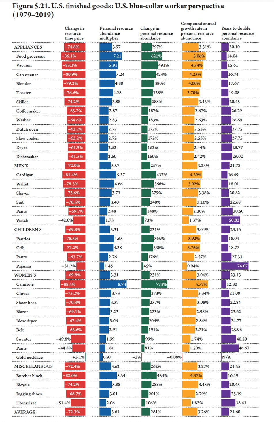
In our 2022 book Superabundance: The Story of Population Growth, Innovation, and Human Flourishing on an Infinitely Bountiful Planet, Gale L. Pooley and I looked at the time prices (i.e., the number of hours and minutes of work an American blue-collar worker has to work to buy something) of a variety of foods, fuels, minerals, and metals. One table (p. 172) is devoted to time prices of 35 finished goods between 1979 and 2019, the average time price of which fell by 72.3 percent. That means that the same length of labor that bought an American blue-collar worker one unit in the basket of 35 finished goods in 1979 got him or her 3.61 units in 2019. The worker’s personal finished goods abundance rose by 261 percent.

The figure illustrates the decline in the price of finished goods over time as their abundance increases. The product categories include appliances, men's goods, children's goods, women's goods, and miscellaneous items.

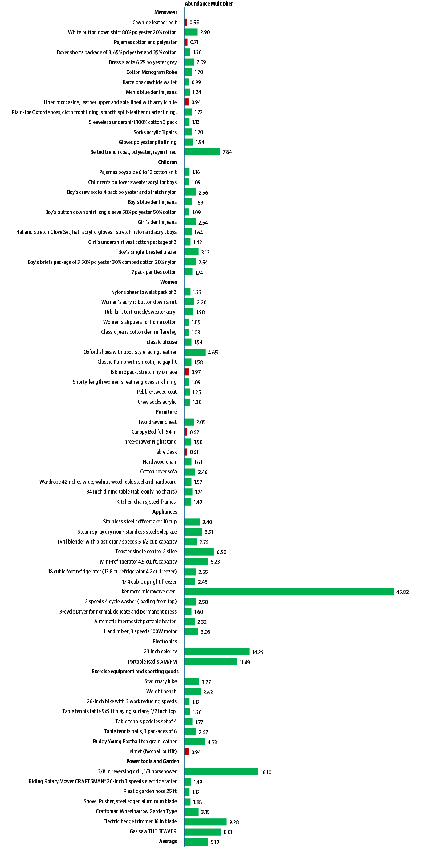
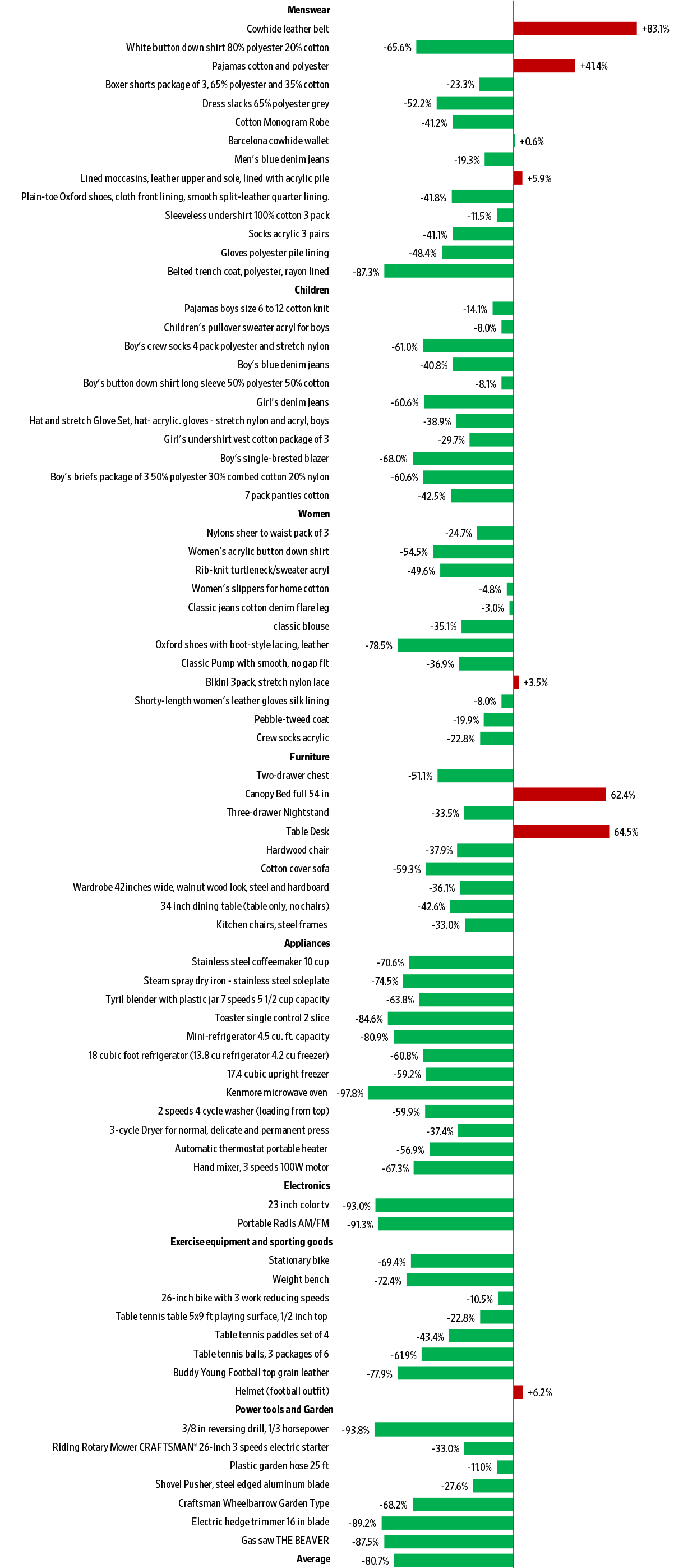
Recently, we undertook a similar exercise to ascertain the effect of the recent bout of inflation on the time prices of 75 finished goods between 1971 and 2024. The 1971 data (i.e., nominal prices of 75 finished goods) came from the 1971 Sears catalog. The 2024 data (i.e., nominal prices of similar 75 finished goods) came from Walmart, Macy’s, JCPenney, Kohl’s, Home Depot and Amazon. We divided the 1971 nominal prices of 75 finished goods by $4.26, which was the hourly compensation rate of the average American blue-collar worker in 1971. We divided the 2024 nominal prices of 75 finished goods by $37.15, which was the approximate average hourly compensation rate of the US blue-collar worker in 2024.

We found that the average time price of menswear, childrenswear, womenswear, furniture, appliances, electronics, sporting goods, and power tools and garden equipment fell 80.7 percent. That means that the same length of labor that bought a US blue-collar worker one unit in the basket of 75 finished goods in 1971 bought that worker 5.19 units in 2024. The worker’s personal abundance of 75 finished goods rose by 419 percent. The compound annual growth rate in personal abundance of finished goods came to 3.16 percent, indicating a doubling of personal abundance every 22.31 years. Given that personal abundance rose by 419 percent, while the US population rose only by 62 percent between 1971 and 2024, we can say that abundance rose at a superabundant rate (i.e., faster than population).

Mostly deregulated markets, where production is subject to competition and automatization, can result in substantial reduction in time price and consequent increase in abundance. Let us keep that in mind as the debate over the appropriate level of restrictions on the freedom of the market rages around the world—from the far-flung New Zealand to our own United States.

U.S. Finished Goods: U.S. Blue-Collar Worker Perspective (1971-2024)

Change in Time Price of U.S. Finished Goods: U.S. Blue-Collar Perspective (1971-2024)

The figure shows a decline in the prices of various goods over time for a blue-collar worker, reflecting rising incomes and increasing material abundance.

Change in Personal Resource Abundance Multiplier of U.S. Finished Goods: U.S. Blue-Collar Perspective (1971-2024)

The figure shows a positive abundance multiplier for almost every finished good.

Blog Post | Housing

The End of the Housing Affordability Crisis

The decline of housing affordability has been a policy choice.

Summary: Americans have enjoyed extraordinary gains in material abundance, yet housing in recent decades stands out as a stubborn exception. Home prices in many parts of the United States have risen faster than incomes, placing growing pressure on renters and first-time buyers. The problem is not an inevitable market failure but the predictable result of supply constraints—especially land-use regulations—that can be reformed to increase affordability.


Americans have seen tremendous advances in the availability and abundance of material goods. As Marian L. Tupy and Gale Pooley from the Cato Institute have shown, the most basic necessity of food became eight times more affordable over the 100 years up to 2019, relative to average wages (the food inflation after 2019 set us back a little bit, but the long-run trends are still quite favorable). This increasing abundance is not limited to food alone, as a wide variety of finished goods have become much more affordable in recent decades.

These positive trends are well known for goods and even some services, such as cosmetic surgeries, but a common objection, both on social media and in real life, is: What about housing? That is a fair question, considering that Americans spend about 25 percent of their pre-tax annual income on housing, which has been a fairly constant share of their income for most of the past 125 years. Given the large share of the budget that housing costs represent, and the failure of housing to decline as a share of the budget as other necessities did, it is worth investigating the problem further.

On housing, the critics do have a point: Housing costs across the US and many other nations have quickly outpaced income growth in recent years. While we shouldn’t be nostalgic for the housing of the 1950s—houses were about half the size of today’s and had fewer amenities we now consider standard, such as air conditioning—nostalgia for the housing of 30 years ago might be justifiable.

Since 1994, two common measures of housing prices, the Case-Shiller Index and the US Department of Housing and Urban Development’s Median Sales Price data, have increased faster than most measures of income, including median family income and average wages. And unlike the change since the 1950s, the recent increase in housing prices can’t be primarily explained by houses getting bigger: The median square footage of new homes sold has increased only 16 percent since 1994 and has even been falling in the past decade.

Even more so, to the extent housing has become more expensive relative to wage growth in recent years, the trend could worsen over the next 30 years—unless we quickly change policy to allow the supply of housing to increase.

It may seem puzzling that housing could remain roughly the same share of income on average in the US, even as housing prices have increased faster than incomes in recent decades. This seeming puzzle can be resolved by thinking about two different kinds of households: renters and homeowners. While renters and homeowners may certainly be different in many ways—renters tend to be younger, poorer, and so on—there is a fundamental difference in how they experience increases in the price of housing. Renters are typically subject to new market-rate rents on a regular basis, often annually. However, if homeowners remain in the same house they are generally insulated from these changes, with only insurance and property taxes possibly increasing annually, not their principal and interest on the mortgage.

These intuitions are borne out in the data. According to the BLS Consumer Expenditure Survey, in 1984 the share of income that renters spent on housing was about 30.4 percent, which rose over the next four decades to 34.4 percent. Homeowners saw the opposite pattern, with the share of their income spent on housing falling from 27.7 percent in 1984 to 22.6 percent in 2024. The overall average has been fairly stable, but the experience of renters and homeowners has diverged.

The Facts of Housing Unaffordability

Historically, the rule of thumb in the United States is to spend no more than 30 percent of income on housing—though as we saw above, on average Americans spend less than that. But averages can obscure cost burdens for some households. According to an analysis of the Census Bureau’s American Community Survey data by Harvard’s Joint Center for Housing Studies (JCHS), fully one-third of US households spent over 30 percent of their income on housing, and 16 percent of households spent over half of their income on housing in 2024. The number of cost-burdened households has been steadily rising in recent years, as the price of both homes and rentals has increased faster than incomes in most of the US.

We can see the problem of rising home values relative to income by looking at another rule of thumb: Home prices should be in the range of three and five times a household’s annual income. In 1994, out of the United States’ 387 metropolitan statistical areas (MSAs), 263 had median home prices that were less than three times the median household income (the data once again come from Harvard’s JCHS). Only 12 MSAs in 1994—mostly in California and Hawaii—had ratios above 5.0.

Fast-forward to 2024, when there were 114 MSAs above the 5.0 ratio of median home prices to income, and those were scattered all over the country. Instead of being in just California and Hawaii, they were also in previously affordable states such as Montana, Wisconsin, North Carolina, and Arkansas. In 2024, the number of MSAs with price-to-income ratios below 3.0 had dwindled to just 32, many of them in the dying Rust Belt. And you don’t even need to go back to 1994 to see the dramatic change. As late as 2019, there were still well over 100 MSAs with a price-to-income ratio below 3.0.

While the majority (241 MSAs) are still within the suggested range of three to five times a household’s income, many are pushing toward the upper end of that range. Given the trend—the median ratio crept up from 2.65 in 1994 to 4.27 in 2024—it is not unreasonable to expect the ratio to continue to increase, absent any changes in policy.

The challenge of housing affordability is not unique to the United States. Using the home-price-to-income ratio from the Organisation for Economic Co-operation and Development (OECD), since 1994 the US saw home prices increase by 20 percent more than incomes did, meaning that housing is more expensive in real terms. Some other countries were in a much worse situation: Australia, Canada, and the United Kingdom all had over 80 percent increases in the ratio of housing prices to income. Not every country followed the same pattern, though. In New Zealand, the price-to-income ratio rose by 126 percent between 1994 and 2021. The ratio declined to 80 percent in 2024. And Japan’s price-to-income ratio fell by 25 percent from 1994 to 2024. However, even Japan has recently seen a modest increase in the ratio, by about 14 percent in the past decade. We’ll look at New Zealand and Japan in more detail below.

The Fix for Housing Affordability

But something can be done. While there have been several political solutions proposed, most of those focused on the demand side, such as subsidies to homeowners or renters. Those kinds of solutions are suboptimal because they increase demand, which will only further increase prices if supply does not also increase. The real problem is on the supply side: There is not enough new housing being built in the places people want to live and of the size people want. What is preventing additional building? In most of the US, it is land-use restrictions such as zoning and other policies that limit the density of new homes. Australia and countries across Europe have implemented similar policies that limit the construction of housing in various ways, primarily in the first half of the 20th century. Price increases did not show up immediately, because in most places restrictions were not binding constraints; there was plenty of land in favorable locations until recent decades.

A major restriction on the supply of housing comes in the form of single-family zoning, which prevents multifamily housing (everything from duplexes to skyscraper apartments) from being built in residential areas. A 2019 analysis by the New York Times found that about 75 percent of residential areas in US cities are reserved for single-family homes. In some cities that figure may reach over 85 percent. Of course, most families probably aspire to eventually own a single-family home, but the zoning laws force most land to be dedicated to this form of housing for everyone. That contributes to making housing unaffordable for many younger families today.

Land-use restrictions limit supply in ways that go beyond merely proscribing that most lots be reserved for single-family homes. For example, regulations will often require lots to be of a minimum size, which is counterproductive because land area is often the most expensive part of the property in urban settings, and the regulation forces families to purchase more land than they want. Regulations also set a maximum amount (a common range is 40–60 percent) of the lot that can be covered by the building itself, essentially forcing homes to have large lawns. Again, many families might want a large lot with a large lawn, but these regulations require it for everyone. The problem is that the less land dedicated to the home itself, the less land there is for other homes in the same area. These rules preclude single-family home types that were common in the past in large American cities, such as row houses or townhouses, which typically occupy most of the small lots they sit on.

Zoning Reforms Work

Would reforming land-use regulations really increase the supply of housing and make it more affordable? The available evidence indeed suggests it would.

One example of reform is New Zealand’s largest city, Auckland, which in 2016 reformed residential zoning to allow for more intensive housing—duplexes, triplexes, townhomes, and the like—on most residential land. This process is referred to as “upzoning.” The results were staggering: As documented in a paper published in the Journal of Urban Economics, construction boomed, with permits doubling in five years. The economists who studied this reform found that rents were 26–33 percent lower than they would have been without it. Rents kept skyrocketing in the rest of New Zealand but stabilized in the parts of Auckland that were upzoned. As mentioned above, New Zealand is notable for seeing its home-price-to-income ratio fall after 2021: As rents stabilized and incomes continued to grow, the ratio declined.

Another example comes from Houston, the fourth-largest city in the US. Houston has long been known as the shining example of a major US city that never adopted citywide zoning, even though some neighborhoods have private deed restrictions that incorporate features similar to zoning. But despite eschewing traditional zoning, Houston still has land-use regulations of various sorts. For example, like most cities, Houston prescribed a minimum lot size of 5,000 square feet. Because people would’ve been paying for more land than they needed, alternate forms of housing such as townhomes were less likely to be built.  First in 1998 and then in 2013, Houston reduced the minimum lot size to just 1,400 square feet in parts of the city. As Mercatus Center economist Emily Hamilton shows, there was a boom in construction following the reforms. Despite adding over 1 million people between 1970 and 2020, Houston still managed to have median home prices below the national average.

If Houston and Auckland demonstrate the power of local reform, Tokyo shows what is possible when a nation treats housing as essential infrastructure rather than a matter set by local competing interest groups. As urban scholar André Sorensen details in The Making of Urban Japan (2002), the country stripped municipalities of the power to block code-compliant projects, effectively turning zoning into a national “right to build” rather than a discretionary local negotiation. The results of this policy choice are astonishing. According to a 2016 analysis by the Financial Times, the city of Tokyo consistently builds more new housing each year than the entire state of California or the whole of England, despite having little empty land to spare. By removing the “veto points” that plague Western cities, Tokyo has achieved the status of a growing, vibrant mega-city where rents have remained flat for decades.

Allowing the Market to Increase Supply Keeps Housing Affordable

As families become richer and the population grows, there is increasing pressure on housing prices in desirable locales. The natural market response to increasing prices is to increase supply. Unfortunately, in much of the US and the rest of the developed world, governments have put artificial barriers in place to prevent this market response. While the housing shortage was created by the political process—through the establishment of zoning and other land-use regulations—the solution does not need to come from governments in the form of subsidizing demand. Instead, to unleash the forces of the market and human initiative, governments need to ease regulations on supply.

Land-use regulations are not the only interference in the market process that makes housing less affordable. Some forms of trade policy and protectionism can also harm home prices. For example, the National Association of Home Builders (NAHB) estimates that recent tariff increases for lumber and other inputs can add at least $10,000 to the average price of a home. Even more costly are building regulations, which the NAHB estimated could exceed $90,000 for a typical home in 2021 and were around 40 percent of the cost of multifamily housing such as apartment buildings. While not all of these regulations could be eliminated immediately, the best thing governments can do to address the affordability issue in housing is to figure out how they can get out of the way.

Blog Post | Cost of Living

A New Way to Understand American Abundance

Our index measures how long you have to work to buy what you used to buy.

Summary: Our new American Abundance Index measures living standards by asking one question: How long do you have to work to buy what you used to buy? Time prices offer a clearer view of American abundance than wages or dollar prices alone. Using standard government data, the index shows that despite recent inflation concerns, time prices have generally fallen and abundance has risen over the long term for the average worker.


Americans are told, daily, that they are getting poorer. The left points to “record” prices and concludes that capitalism has failed. The right points to the same prices and concludes that America is in irreversible decline. Both sides lean on a familiar statistical trick: they talk about prices or pay in isolation, then invite readers to fill in the rest with anxiety.

There is a simpler and truer way to judge living standards. Ask one question: How long do you have to work to buy what you used to buy?

That is the idea behind the new American Abundance Index, a tool that translates economic health into units normal people understand: hours of work. It uses standard government statistics, comparing inflation (the Consumer Price Index) with hourly earnings from the Bureau of Labor Statistics. The output is not a partisan narrative. It is a measure of purchasing power that speaks plain English.

The index tracks two measures. Time Price represents how many work-hours are needed to purchase the standard CPI basket of goods and services. Abundance is the inverse. It represents how much of that basket one hour of work can buy.

When time prices fall, abundance rises. When time prices rise, abundance falls.

The American Abundance Index starts in March 2006, when the relevant earnings series become available, and updates monthly following BLS releases. It reports month-over-month, year-over-year, five-year, ten-year, and since-start changes so readers can separate short-term noise from long-term reality.

That distinction matters because the loudest arguments about living standards are usually built on selective time windows.

Recent numbers illustrate the point. For the average private-sector worker, December 2025 saw a tiny monthly decline in CPI and a larger rise in average hourly earnings. The result was a decline in time prices and a rise in abundance for that month. Over the year from December 2024 to December 2025, CPI rose 2.68 percent while hourly earnings rose 3.76 percent. Time prices fell 1.04 percent, and abundance rose 1.05 percent.

Zoom out further. Since March 2006, time prices for the BLS basket have fallen 12.16 percent and abundance has risen 13.84 percent. The index translates those findings into an intuitive claim: over that period, the average private-sector worker gained the equivalent of roughly 1.1 extra hours of purchasing power for every eight hours worked.

The product is not just one headline series. It includes separate views for all private-sector workers and for blue-collar workers. It also includes “upskilling” scenarios that reflect a basic fact of labor markets that both ideological camps often ignore: people do not stay in the same job, at the same wage, for decades. Many workers move from entry-level roles into higher-paying roles as they gain skills. A living-standards tool should help readers see what that typical path implies for purchasing power over time, rather than freezing workers in place for rhetorical effect.

So how does this fit into today’s abundance argument, and the misuse of statistics by left and right?

The left’s favorite move is to spotlight prices, preferably the most salient and emotionally charged ones, then treat the price level as the full story. But prices are only half the equation. Wages and work-hours are the other half. If pay rises faster than prices, the public is not “getting poorer” in any meaningful aggregate sense, even if the public is angry, and even if some groups are falling behind.

The right’s favorite move is different but no less misleading. It treats every inflation episode, every housing squeeze, and every bout of consumer pessimism as proof of national decline. It cherry-picks peaks, ignores recoveries, and sometimes talks as if today’s worker has no mobility and no capacity to adapt. That is how you turn real problems into a permanent story of collapse.

The American Abundance Index does not settle policy debates. It disciplines them. It forces advocates to answer the question that matters to households: How many minutes of my life does this cost, and how has that changed? If your preferred policy raises time prices, you are making people poorer, whatever your rhetoric. If it lowers time prices, you are making people richer, even if it offends someone’s ideology.

The index is also candid about limits. It focuses on averages, may not capture individual experiences, and is most meaningful over longer periods than a single month. That is not a weakness. It is a reminder that serious measurement should separate broad trends from personal hardship, and that anecdotes are not statistics.

If journalists and politicians want fewer mirages and more reality, they should start here: stop counting dollars. Start counting hours.

Blog Post | Cost of Material Goods

Ice Blocks to Electrons: The Rise of Refrigeration Abundance

Workers today get 214 refrigerators for the time price of one in 1925.

Summary: A century ago, people used large ice blocks and wooden cabinets to keep food cold. Today, electric refrigeration is more affordable, easy, and reliable thanks to technological innovation. The shift from ice blocks to electrons shows how human ingenuity can transform necessities from costly burdens into everyday conveniences.


In 1925, households kept food cool with iceboxes—wooden insulated cabinets chilled by a block of ice. Depending on size and quality, they typically cost between $15 and $50. With entry-level workers earning about $0.25 an hour, a $35 icebox carried a time price of 140 hours.

Today, a 4.4-cubic-foot mini fridge at Walmart sells for about $184. Entry-level workers in limited-service restaurants earn roughly $18.75 an hour, bringing the time price down to just 9.8 hours.

For the time it took a worker in 1925 to earn the money for one icebox, a worker today can buy 14.3 mini fridges.

The 1925 icebox didn’t actually come with any ice. The price of a 100-pound block of ice in 1925 was typically $0.25, and that could double during “ice famines” caused by mild winters. At $0.25 an hour, a 100-pound block of ice would cost one hour and would generally last for three to seven days. If the ice block lasted five days that would be a time price of 12 minutes a day.

The Walmart mini fridge requires 269 kilowatt-hours (kWh) per year, or 0.74 kWh per day. Residential electricity runs around $0.12 per kWh, so a year’s supply of electricity for cooling will cost $32.28, or 1.72 hours for entry-level workers. Spread out over the year, it would require 17 seconds a day.

For the time it took a worker in 1925 to earn the money to buy ice cooling for a day, workers today get 43 days of electric cooling.

Electric refrigerators entered American homes in 1927 when General Electric introduced the iconic “Monitor Top,” named for its resemblance to the USS Monitor, a Civil War ironclad warship. The unit sold for $525. With entry-level workers earning $0.25 an hour, the time price came to an extraordinary 2,100 hours. Today, the Walmart mini fridge costs 9.8 hours of work. The time price has fallen 99.53 percent. For the time it took a worker in 1927 to earn enough money for one electric refrigerator, a worker today can buy 214 mini fridges—a stunning increase of 21,300 percent in refrigeration abundance, compounding at 5.62 percent a year.

The US population has tripled from 116 million in 1925 to 348 million today. For every 1 percent increase in population, personal refrigerator abundance has increased 106 percent (21,300% ÷ 200% = 106%).

IEEE Spectrum | Cost of Technology

Sub-$200 Lidar Could Reshuffle Auto-Sensor Economics

“MicroVision, a solid-state sensor technology company located in Redmond, Wash., says it has designed a solid-state automotive lidar sensor intended to reach production pricing below US $200. That’s less than half of typical prices now, and it’s not even the full extent of the company’s ambition. The company says its longer-term goal is $100 per unit. MicroVision’s claim, which, if realized, would place lidar within reach of advanced driver-assistance systems (ADAS) rather than limiting it to high-end autonomous vehicle programs. Lidar’s limited market penetration comes down to one issue: cost.

Comparable mechanical lidars from multiple suppliers now sell in the $10,000 to $20,000 range. That price—roughly a tenfold drop, from about $80,000—helps explain why suppliers now are now hopeful that another steep price reduction is on the horizon.”

From IEEE Spectrum.