Nineteenth Century Inequality Not As Bad As We Think
A proper interpretation of consumption data shows that the 1800s fostered an egalitarian shift in wealth distribution.
Joakim Book —
When prices change, how that impacts people depends crucially on which prices increase and what goods and services people are consuming. Across the western world, price inflation–the rate at which prices increase–has been relatively slow for over a decade. Central bankers have consistently undershot their inflation targets despite their careful implentation of complex monetary policy.
The supposed dearth of inflation might seem like small comfort–or a cruel joke–to the Californian hipster paying $15 for a smoothie bowl, the German renter whose rents are increasing at a stunning rate or the London young professional shoveling out £5 for an unimpressive lunch sandwich. The larger the diversity in consumption patterns, the less appropriate it is to aggregate price changes into a general price index such as CPI or PCE statistics.
One reason for the dissonance between official figures and real-world experience is the weight that statisticians place on various items when constructing a consumer price index (e.g. the Bank of England’s CPI; the ECB’s HICP; the Fed’s PCE). For instance, in the price index used by the European Central Bank, housing costs make up only 17% of the index, whereas the Federal Reserve places a 24% weight on housing expenses. That divergence turns a 25% increase in housing costs–with all other prices and consumption patterns held constant–into a 4.25% overall inflation in the Eurozone but a 6% inflation in the U.S.
While policymakers are aware of those data limitations and we have standardized statistical ways to adjust for quality improvements, these problems can still cause headaches. One illustrative example is the impact of iPhone prices on Sweden’s price index; Martin Enlund, FX strategist at Nordea, estimates that the quality adjustment of iPhones alone reduced the reported price increase by 0.1 percentage points every year for the last 5 years.
That minor detail has some implication for our modern world, considering that the Riksbank’s interest rate decisions have turned on such small margins before. Looking at these differences in consumption bundles and quality adjustments over longer historical periods, they quickly become astronomical. In a famous paper, Nobel Laureate William Nordhaus surveyed “lumens”–a unit for light–emitted by various sources throughout the centuries. Nordhaus estimated the price of light, the essential service its originators provide us with, to have fallen by 99.97% between 1800 and 1992.
Over decades or centuries, even small differences can result in very large adjustments when we evaluate past incomes. For instance, how much better is a computer as a calculating tool than an abacus? Is a keyboard and word processor ten, fifty or a hundred times better than quills, ink, and bulky, slowly decaying paper?
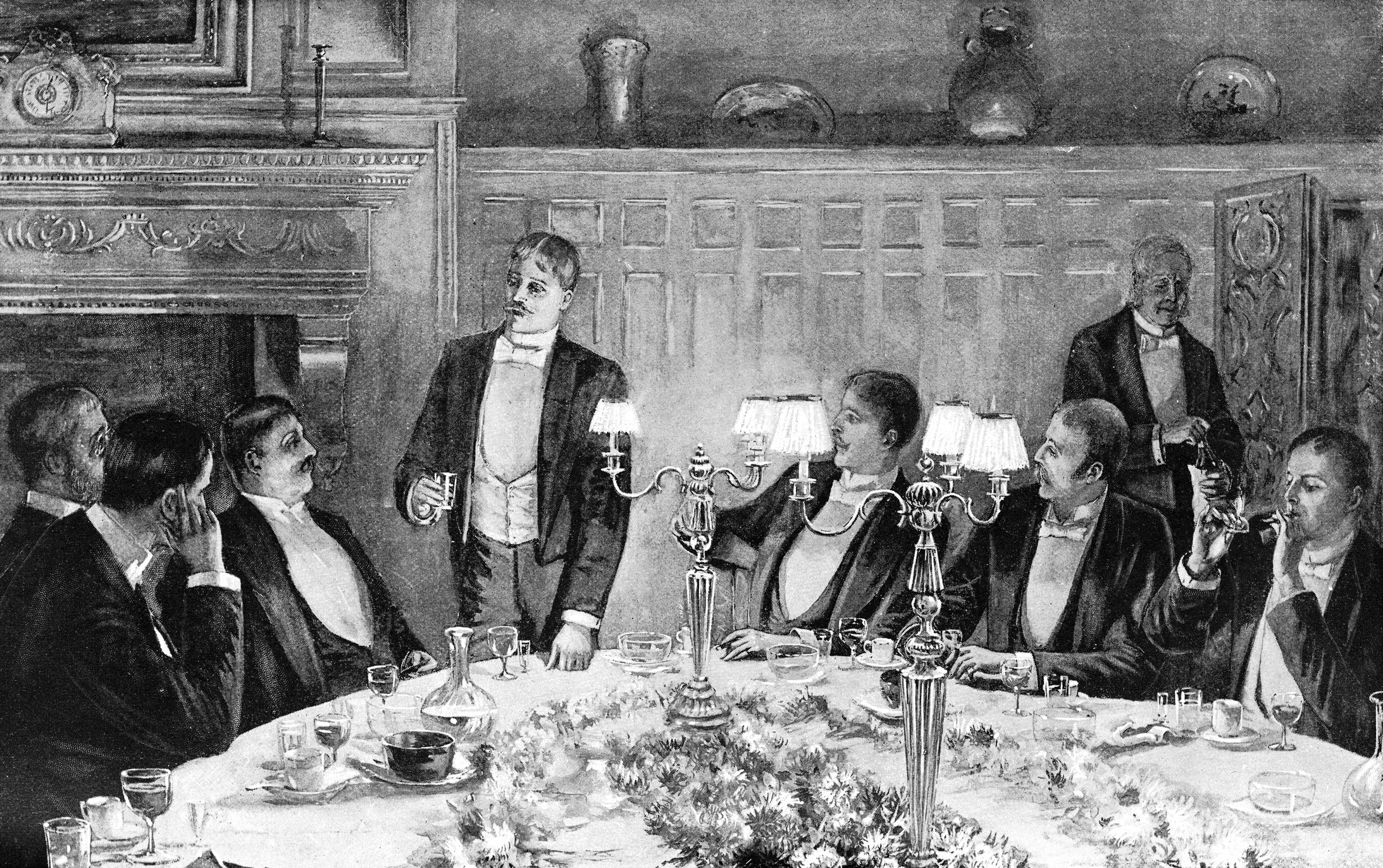
A recent study by Vincent Geloso and Peter Lindert makes a big deal out of consumption bundles. By disaggregating purchases by working classes and upper classes, they make a revolutionary discovery: beginning earlier than we used to believe, the poor’s standards of living improved faster than those of the rich. Contrary to the tired claim that capitalism involves the rich getting richer while the poor get poorer, it seems that during the 19th century the opposite was true.
The authors reach this conclusion by using different consumption bundles for two different income segments. People’s standards of living depend on what they themselves consume, not on what they could buy if they had the rich’s consumption patterns:
“[T]he contrasts that matter are contrasts in individuals’ abilities to buy what they care to buy, or need to buy, and not the (nominal) inequality in their ability to buy the same common bundle as some other class could buy.”
The components that drove this extraordinary reduction in cost of living, argue Geloso and Lindert, were falling prices of grain-based foods and a rise in the relative price of services that the poorer classes supplied (mostly wage rates for common labor).
The American rise in inequality over the nineteenth century, using both top-1% / bottom-99% and top-10% / bottom-40% metrics, is much less pronounced than previously believed. The authors conclude:
“[T]he ‘nineteenth-century’ period 1815–1914 brought a clearly egalitarian shift in the price structure for all four countries—England, Canada, the USA, and post-1850 Australia. The net change over these 100 years is unmistakable.”
A century before Paul Ehrlich would predict imminent starvation in the entire world (specifically in what he thought was a remarkably backwards India), the world surplus of grains had enriched the poor–even in the “dark Satanic mills” of Britain. The lower relative price of grains mitigated and partly reversed the economic inequality we tend to associate with the nineteenth century.
The exact bundles used to measure consumption matter greatly for understanding prosperity, today as well as in the past.
Poverty Declines in Georgia as Income Inequality Decreases in 2024
“The National Statistics Office recently published data revealing that Georgia saw a significant decline in poverty in 2024, with the national absolute poverty rate dropping to 9.4%, down 2.4 percentage points from the previous year.”
Wage Inequality Declined in Most Countries Since Start of 21st Century
“The Global Wage Report 2024-25 finds that since the early 2000’s, on average, wage inequality, which compares the wages of high and low wage earners, decreased in many countries at an average rate that ranged from 0.5 to 1.7 per cent annually, depending on the measure used. The most significant decreases occurred among low-income countries where the average annual decrease ranged from 3.2 to 9.6 per cent in the past two decades.
Wage inequality is declining at a slower pace in wealthier countries, shrinking annually between 0.3 and 1.3 per cent in upper-middle-income-countries, and between 0.3 to 0.7 per cent in high-income countries”
In some ways, this is perhaps a somewhat boring answer about facts, but that’s what makes it important; we have to get the facts straight. The numbers that people’s opinions are based on are not correct. There are various ways in which they aren’t, but two big ones.
The first is that when the US census measures income, it doesn’t count two-thirds of what are called transfer payments, or money that the government gives to people for not doing anything. In other words, a transfer payment is not what we pay civil servants or the military. Transfer payments are things like food stamps or Medicaid, which are also two examples of things that the census does not count. They also don’t count 88 percent of the transfer payments that go to people who are classified as poor. They don’t count Medicare for the senior population. They don’t count what is called Supplemental Security Income. They don’t count many state and local transfer payments to poor people. They count some housing subsidies, the so-called Section 8 subsidies, but they don’t count others.
When you add all the pieces up, two-thirds of the total amount of transfer payments aren’t counted. So that’s one big piece.
The other big piece is they don’t adjust for taxes. At the bottom end of the income scale, people pay about seven and a half percent of their income in taxes, mostly sales taxes and excise taxes. At the upper end of the income scale, people pay between 35 and 40 percent of their income in taxes, mostly income taxes. So, if you don’t adjust for those taxes, you end up with a very skewed view of the income distribution.
The census splits US households into five groups based on income. The bottom quintile has the least income, and the top quintile has the most. Using the official census definition of income, the ratio between the top and the bottom is 16.7 to 1, so the top quintile has 16.7 times more income than the bottom.
Now, the first thing we did was ask what income was missing. Well, the first thing we found that was missing was capital gains. Capital gains are not counted as income for reasons that aren’t clear. That, of course, is missing mostly from the top half of the income distribution. At the low end of the distribution, there’s all sorts of income misreporting. Not terribly large, but there is some, people just don’t report all their income. And in the middle, employer-paid benefits are missing. So, adding all that earned income data made the ratio between the top and bottom much bigger. The top quintile earns 60 times more income than the bottom quintile.
But we’re still missing two-thirds of the transfer payments. If we add all the transfer payments, the difference between the top and bottom drops to 5.7 to 1.
So that’s all the money coming in, but the census also ignores the money the government takes through taxes. If we compare after-tax income and after-transfer payment income, the difference drops to only 4 to 1.
So, we’ve gone from 16.7 to 1 to 4 to 1 after counting all the money. We didn’t have to redefine anything.
Let me hit a couple of other points here.
It’s not only that the difference between the top and the bottom became smaller after adding all the income data and accounting for taxes. The differences between the bottom, the next to the bottom, and the middle virtually disappear. The bottom 60 percent of Americans all have almost the same amount of income. Let me explain that a bit.
Income in the second quintile is only 8 percent larger than in the bottom quintile. And yet there are 2.8 times more people working in second quintile households. And when they work, they work 1.8 times more hours. They work nearly 40 hours, and people in the bottom quintile work less than 20. And in the middle quintile, there is 32 percent more income, but over three times more people are working, and they work more than twice as many hours. They put out a whole lot more effort and don’t get much more income.
Now, there’s another important wrinkle: adjusting households for size. Households in the bottom quintile tend to be single individuals, retired individuals, people who’ve just graduated from college, and so on. Households become larger as you go up the income scale. When you adjust for size, the bottom quintile actually receives 5 percent more income than the second quintile does. And only 7 percent less than the middle.
There’s also the issue of change over time. There’s something called the Gini coefficient. It’s a measure that’s set up so that at zero, you have perfect equality. Every household has the same income. And at 1, all the income is in one household. The census publishes this measure, and it has risen over the long term. When President Obama or Chuck Schumer says income inequality is awful and it’s getting worse, this is what they’re referring to. But they don’t count all the transfer payments, which have gone from being like 10 percent of our federal budget to 75 percent over time. If you count all the transfers and take away the taxes, the Gini coefficient has actually fallen.
There’s also the question of economic mobility. In a previous paper, you found that two-thirds of children reared in the lowest quintile at some point escape to a higher quintile as adults. I don’t think people realize just how economically mobile Americans are.
Your last point there is really important. Almost all income distribution data are a slice in time. So, the statement that “the poor are getting poorer and the rich are getting richer” is just wrong because these categories are not static: people who were poor ten years ago are rich today, and some previously rich folks have fallen into lower income levels. Now, there are studies that track the same people through time, and during one’s lifetime, you generally move up. Almost everyone’s income goes up, except for those who choose not to participate in the labor force. Although their income goes up too because we keep raising the transfer payments.
The same also applies to income groups. In 1967, the top quintile of households were those that made around $60,000 or more in 2017 dollars. The people in the bottom quintile made between zero and $15,000 in 2017 dollars. In 2017, 77 percent of the population was making incomes that would have placed them in the top quintile 50 years earlier. That’s inflation-adjusted. And fewer than 2 percent of the people in the bottom quintile in 2017 would have been in the bottom quintile 50 years ago. So, throughout the income distribution, we’re all a whole lot better off.
Now, are we better off than five years ago? Well, some of us are, and some of us aren’t, but the overwhelming majority of us are better off than our parents and grandparents were. Far better off.
What is another hopeful fact about the US economy right now that people may not be aware of?
If you measure it right, the share of Americans in poverty has dropped from about 14 percent back when the war on poverty began to 1.1 percent.
So, when Lyndon B. Johnson declared the war on poverty in 1964, the poverty rate had declined from over 30 percent in the 1940s and 50s to around 17 percent. Now, what happened after that? Well, poverty continued to decline at the same rate for another four or five years. Then, it stopped going down and started rising and falling with the business cycle.
Why do you suppose that happened?
Mismeasurement.
Exactly. We declared a war on poverty. We started giving people a lot of money, but we didn’t measure that money as income. And so, it bounced between 11 percent and 15 percent, back and forth, back and forth. It dropped below 11 percent last year, but it’s still in the same range. But if we count all the transfer payments, it’s only 2.5 percent. And if we correct for the CPI overstating inflation, poverty would be less than 2 percent.
So, poverty has virtually disappeared. The people in that 2 percent are people who are especially challenged, either mentally or physically, and they may need help. But most people who are called poor are simply getting lots of money from the government, and they’re not poor anymore.
Johnson had two objectives for the war on poverty. One was to alleviate the suffering of those who were poor, but the other was to enable them to become productive citizens. We completely failed at that one. Only one third of work-age adults in the bottom quintile have a job. Back when Johnson started the war on poverty, two-thirds of them did.
Why? The government’s paying them to do nothing. So, they do nothing.
Get John Early’s book, The Myth of American Inequality: How Government Biases Policy Debate, here.
John Early, a mathematical economist and adjunct scholar at the Cato Institute, joins Chelsea Follett to discuss popular misconceptions about inequality in the United States and the measurement errors behind them. To see the slides that accompany the interview, watch the video on YouTube or the Spotify app.