
It can be hard to remember that even in wealthy countries, food has not always been abundant, and in many parts of the world hunger remains a problem. Fortunately, we are making great headway towards solving it. Here are five charts summarizing the incredible progress that humanity has made against hunger.
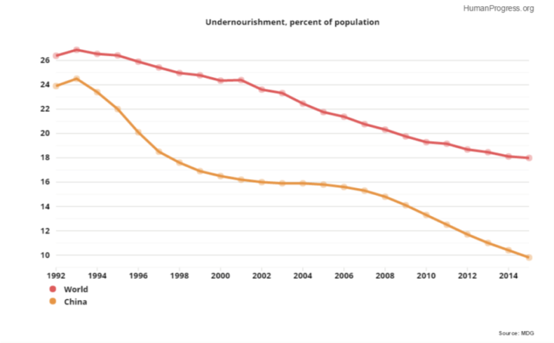
1. According to data from the United Nations, as recently as 1992, over a quarter of the world’s population was undernourished. Since then, a dramatic decline in hunger has occurred, particularly in places like China where economic liberalization has led to rapid development. In 2015, the share of the world population suffering from undernourishment had fallen to about 18 percent, while in China it had fallen even further, to less than 10 percent.
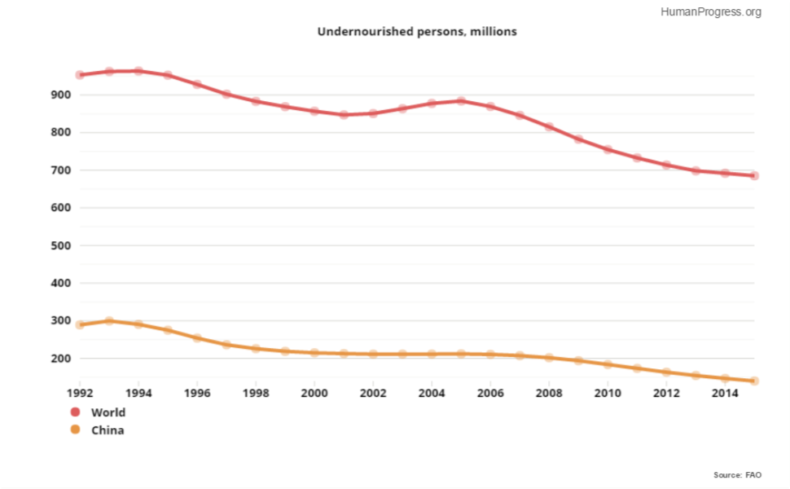
2. Not only do fewer people go hungry as a share of the population, but the total number of people suffering from hunger has also declined. Despite population growth, the number of undernourished persons has fallen from over 950 million in 1992 to about 685 million in 2015. That’s almost 270 million fewer undernourished people or a 28 percent reduction. China saw a more dramatic reduction of 51 percent. In 2015, 150 million fewer Chinese were undernourished than in 1992.
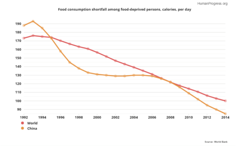
3. And even those who are malnourished are less severely malnourished. The average caloric shortfall among food-deprived persons (i.e., the number of calories by which they come up short of their daily requirement) has been shrinking. In 1992, a malnourished person typically consumed around 170 fewer calories per day than they needed. In China, the malnourished consumed 190 calories less than needed, on average. By 2015, the shortfall had decreased to about 100 calories worldwide and only 85 calories in China.
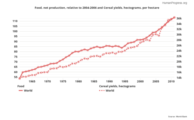
4. How has all of this progress been possible? In order to decrease hunger and feed a growing population, humanity has stepped up to the challenge by producing more food. The amount of food produced per person worldwide is now 20 percent greater than what it was back in 2005. And back in 2005 it was almost double of what it was back in 1961. Thanks to the Green Revolution and subsequent innovations, crop yields (i.e., the amount of food produced per unit of land) have also risen. By producing more food per hectare, we are able to spare more land for other uses and better preserve the environment. Consider cereal yields:
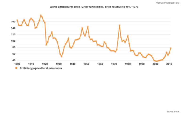
5. Importantly, as the food supply has risen, the cost of food has also fallen, on average. The price index shown below has been adjusted for inflation and represents a composite of eighteen crop and livestock prices weighted by their share of global agricultural trade. Despite an uptick in food prices since 2001, the long-term trend is clearly one of decline. Today, the cost of food is less than half of what it was back in 1900.
This article first appeared in CapX.